Step-by-Step Guide to a Hand‑Drawn CSS Card with Hover Effects
In the vast landscape of web design, sometimes you want elements that stand out, that feel a little different and bring a touch of personality to your projects. This is where creative UI snippets come in handy! Today, we’re diving into a delightful HTML and CSS snippet that crafts an illustrative card design, reminiscent of something you might find in a charming storybook. Get ready to explore how to create a unique card with hand-drawn borders, watercolor backgrounds, and a playful illustration that will surely capture attention. This design works great for:
- Interactive portfolio pieces
- Product feature highlights
- Botanical/artistic website elements
The Foundation: HTML Structure for Our Storybook Card
Our whimsical card starts with a clean and semantic HTML structure. Let’s break down the essential elements:
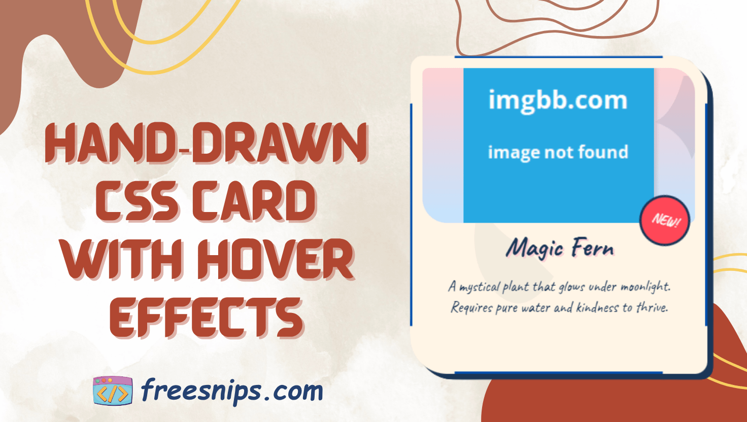
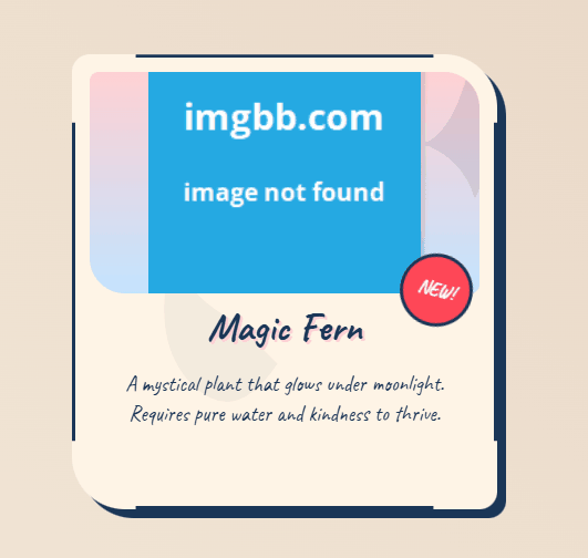
<div class="storybook-card">
      <div class="handdrawn-border"></div>
      <div class="ink-splash"></div>
      <div class="illustration-container">
      <div class="floral-decoration"></div>
        <img src="illustration-plant.png" class="main-illustration" alt="Whimsical plant">
      </div>
      <div class="content">
            <div class="stamp">NEW!</div>
            <h2>Magic Fern</h2>
            <p>A mystical plant that glows under moonlight.<br>
               Requires pure water and kindness to thrive.
           </p>
      </div>
</div>.storybook-card: This is our main container, the wrapper for the entire card. Think of it as the cover of our storybook..handdrawn-border: We’ll use CSS to create a unique, slightly irregular border around the card, giving it that hand-drawn feel..ink-splash: This subtle element adds a touch of organic texture to the background of the card..illustration-container: This acts as a frame for our main image, providing a colorful backdrop and managing its display..floral-decoration: A repeating SVG pattern adds a delicate, whimsical touch to the illustration’s background..main-illustration: This is where your main image or illustration will live. In this example, it’s a charming plant. Remember to use descriptivealttext for accessibility!.content: This section holds the textual information of our card, like the title and description..stamp: A small, angled element to draw attention to new or featured items.
Painting the Scene: CSS Styling for Visual Appeal
<style>
    :root {
        --ink-blue: #1a3657;
        --paper: #fff5e6;
        --watercolor-1: #ffd1d4;
        --watercolor-2: #c4e4ff;
    }

    body { /* Basic body styling for centering */
        min-height: 100vh;
        display: grid;
        place-items: center;
        background: linear-gradient(45deg, #f3e9d9, #e8d5c4);
        margin: 0;
        font-family: 'Caveat', cursive; /* A lovely, handwritten-style font */
    }

    .storybook-card { /* Main card styling */
        position: relative;
        width: 320px;
        background: var(--paper);
        border-radius: 16px 48px 16px 48px; /* Asymmetrical rounded corners */
        padding: 2rem;
        box-shadow: 8px 8px 0 var(--ink-blue); /* Offset shadow for depth */
        transition: 0.4s ease-in-out; /* Smooth transition for hover effect */
        cursor: pointer; /* Indicates it's interactive */
    }

    .storybook-card:hover { /* Hover effect */
        transform: rotate(-2deg) translateY(-8px); /* Slight rotation and lift */
        box-shadow: 12px 12px 0 var(--ink-blue); /* Increased shadow on hover */
    }

    .handdrawn-border { /* Creating the irregular border */
        position: absolute;
        inset: 0;
        border: 3px solid var(--ink-blue);
        border-radius: inherit; /* Inherits the card's rounded corners */
        clip-path: polygon( /* Defines the irregular shape */
            0% 15%, 15% 15%, 15% 0%, 85% 0%, 85% 15%,
            100% 15%, 100% 85%, 85% 85%, 85% 100%,
            15% 100%, 15% 85%, 0% 85%
        );
    }

    .illustration-container { /* Styling the illustration background */
        position: relative;
        height: 200px;
        margin: -1rem; /* Extend beyond the card padding */
        background: linear-gradient(var(--watercolor-1), var(--watercolor-2)); /* Soft gradient */
        border-radius: 8px 32px 8px 32px; /* Matching rounded corners */
        overflow: hidden; /* Keeps the floral decoration within bounds */
    }

    .floral-decoration { /* Subtle floral pattern animation */
        position: absolute;
        width: 120%;
        height: 120%;
        background: url('data:image/svg+xml,<svg xmlns="http://www.w3.org/2000/svg" viewBox="0 0 100 100"><path d="M50 5Q55 25 65 30q-15 5-20 20-5-15-20-20 10-5 15-25z" fill="%231a3657" opacity="0.1"/></svg>');
        animation: float 8s infinite ease-in-out; /* Gentle floating animation */
    }

    .main-illustration { /* Styling the main image */
        position: absolute;
        width: 70%;
        left: 15%;
        bottom: 0;
        filter: drop-shadow(4px 4px 2px rgba(0,0,0,0.1)); /* Soft shadow */
        transition: 0.4s ease-in-out; /* Smooth transition for hover */
    }

    .storybook-card:hover .main-illustration { /* Hover effect on the image */
        transform: translateY(-8px) rotate(5deg); /* Slight lift and rotation */
    }

    .content { /* Styling the text content */
        position: relative;
        padding: 1.5rem 0;
        color: var(--ink-blue);
        text-align: center;
    }

    h2 { /* Styling the title */
        font-size: 2.2rem;
        margin: 0;
        text-shadow: 2px 2px 0 var(--watercolor-1); /* Subtle text shadow */
    }

    p { /* Styling the paragraph */
        font-size: 1.2rem;
        line-height: 1.4;
        margin: 1rem 0;
    }

    .stamp { /* Styling the "NEW!" stamp */
        position: absolute;
        top: -20px;
        right: -10px;
        width: 60px;
        height: 60px;
        background: #ff4757;
        border-radius: 50%;
        transform: rotate(15deg);
        border: 3px solid var(--ink-blue);
        display: grid;
        place-items: center;
        font-weight: bold;
        color: white;
    }

    @keyframes float { /* Keyframe animation for the floral decoration */
        0%, 100% { transform: translateY(0) rotate(0deg); }
        50% { transform: translateY(-10px) rotate(2deg); }
    }

    .ink-splash { /* Subtle ink splash background */
        position: absolute;
        width: 100%;
        height: 100%;
        background: url('data:image/svg+xml,<svg xmlns="http://www.w3.org/2000/svg" viewBox="0 0 100 100"><path d="M30 50q-10-5-15-15-5 20 5 30t20-5z" fill="%231a3657" opacity="0.05"/></svg>');
        animation: inkFlow 12s infinite linear; /* Slow, subtle movement */
    }

    @keyframes inkFlow { /* Keyframe for the ink splash movement */
        100% { background-position: 100% 100%; }
    }
</style>
Background & layout: A linear-gradient on the body sets a soft, storybook vibe.
Card styling: Rounded corners with alternating radii (16px 48px 16px 48px) give a hand‑drawn feel. Shadows use our --ink-blue.
Borders & splashes: We clip the border into jagged polygons and layer SVG ink splashes via background:url(data:image/svg+xml…).
Animations:
.floral-decorationfloats with@keyframes float..ink-splashsubtly drifts with@keyframes inkFlow.
Hover effects: On hover the entire card tilts and lifts, and the main illustration “bobs” up and rotates.
Code Breakdown: Putting It All Together
To summarize how this code works:
- HTML provides the structure: It defines the different parts of the card – the border, illustration area, image, text content, and the “NEW!” stamp.
- CSS handles the styling: It uses colors, gradients, shadows, rounded corners, and
clip-pathto create the visual appearance. Animations add subtle movement, and the:hovereffect provides interactivity. - The combination creates a unique illustrative card: The slightly irregular border, soft watercolor background, playful illustration, and subtle animations work together to give the card a handcrafted, storybook-like feel.
Customization Tips
- Colors & themes: Tweak the
--ink-blue,--paper,--watercolor-*variables to match your brand palette. - Border shape: Adjust the
clip-pathpercentages to create unique “hand‑drawn” feels. - Animation speed: Shorten animation durations (e.g.,
4s) for a livelier motion or lengthen (e.g.,12s) for a more subtle effect. - Text content: Swap the
<h2>and<p>with your own product name or feature list.
Conclusion: Unleash Your Creative UI
This illustrative card design snippet demonstrates how combining thoughtful HTML structure with creative CSS styling can result in unique and engaging user interface elements. By understanding the techniques used here, you can adapt and customize this code to bring a touch of magic and personality to your own web projects. So go ahead, experiment, and let your creativity flourish!