
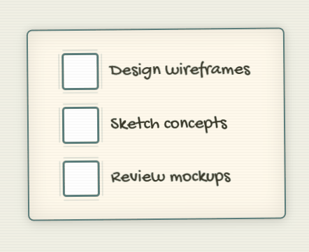
How to Create Sketchy Hand Drawn Checkboxes with HTML & CSS
Tired of the same old boring checkboxes? Want to inject a bit of personality and a touch of whimsy into your web forms? In this tutorial, we’ll guide you through creating these adorable, sketchbook-inspired hand drawn checkboxes using just HTML and CSS. Get ready to make your users smile every time they tick off a task! This approach not only enhances the visual appeal but also provides a unique and engaging user experience.
Introduction
Checkboxes are one of the most common UI elements—but default browser styles can feel dull. In this tutorial, you’ll learn how to build playful, sketch-style checkboxes using only HTML and CSS. We’ll cover file setup, markup structure, styling techniques, code breakdown, customization ideas, and accessibility best practices so you can drop these hand-drawn checkboxes into any project.
Setup File Structure
For this tutorial, we’ll keep the CSS directly within the <style> tags in the index.html file for simplicity. However, feel free to create a separate style.css file and link it in the <head> of your HTML:
<link rel="stylesheet" href="style.css">HTML Structure
In index.html, wrap your checkboxes in a container and use a visually hidden native <input> paired with a styled <span>:
   <div class="checkbox-group">
        <label class="checkbox-container">
            <input type="checkbox" class="original-checkbox">
            <span class="custom-checkbox"></span>
            <span class="label-text">Design wireframes</span>
        </label>

        <label class="checkbox-container">
            <input type="checkbox" class="original-checkbox">
            <span class="custom-checkbox"></span>
            <span class="label-text">Sketch concepts</span>
        </label>

        <label class="checkbox-container">
            <input type="checkbox" class="original-checkbox">
            <span class="custom-checkbox"></span>
            <span class="label-text">Review mockups</span>
        </label>
    </div>
Here’s a breakdown of the key HTML elements:
<div class="checkbox-group">: This acts as a container for all our custom checkboxes, providing a nice paper-like background and styling.<label class="checkbox-container">: Each checkbox and its label are wrapped in a<label>. This is crucial for accessibility, as it associates the text with the checkbox.<input type="checkbox" class="original-checkbox">: This is the actual, functional checkbox. We visually hide it but keep it for its inherent behavior.<span class="custom-checkbox"></span>: This emptyspanis what we’ll style to look like our custom checkbox.<span class="label-text">: Thisspanholds the descriptive text for each checkbox.
CSS Styling (<style> tags or style.css)
   :root {
            --primary-color: #5a7d7b;
            --secondary-color: #e45735;
            --paper-bg: #fff9eb;
            --text-color: #3a3829;
            --shadow-color: rgba(0,0,0,0.1);
        }

        body {
            min-height: 100vh;
            display: flex;
            justify-content: center;
            align-items: center;
            background: #f0f0e5;
            margin: 0;
            padding: 20px;
            position: relative;
        }

        /* Paper texture overlay */
        body::after {
            content: '';
            position: absolute;
            top: 0;
            left: 0;
            width: 100%;
            height: 100%;
            background: repeating-linear-gradient(
                0deg,
                rgba(0,0,0,0.03) 0px,
                rgba(0,0,0,0.03) 1px,
                transparent 1px,
                transparent 4px
            );
            pointer-events: none;
        }

        .checkbox-group {
            background: var(--paper-bg);
            padding: 2rem 3rem;
            border-radius: 8px;
            box-shadow:
                0 0 10px var(--shadow-color),
                0 4px 20px var(--shadow-color),
                inset 0 0 30px var(--shadow-color);
            border: 2px solid var(--primary-color);
            transform: rotate(-0.5deg);
            display: flex;
            flex-direction: column;
            gap: 1.5rem;
        }

        .checkbox-container {
            display: flex;
            align-items: center;
            gap: 1rem;
            cursor: pointer;
            font-family: 'Gochi Hand', cursive;
            font-size: 26px;
            color: var(--text-color);
            transform-style: preserve-3d;
            flex-direction: row;
        }

        .original-checkbox {
            position: absolute;
            opacity: 0;
            height: 0;
            width: 0;
        }

        .custom-checkbox {
            position: relative;
            height: 1.8em;
            width: 1.8em;
            border: 3px solid var(--primary-color);
            border-radius: 5px;
            background: #fff;
            transition: all 0.3s cubic-bezier(0.175, 0.885, 0.32, 1.275);
        }

        /* Sketchy border effect */
        .custom-checkbox::before {
            content: '';
            position: absolute;
            top: -8px;
            left: -8px;
            right: -8px;
            bottom: -8px;
            border: 2px solid var(--primary-color);
            clip-path: polygon(
                0% 10%, 10% 10%, 10% 0%, 90% 0%, 90% 10%,
                100% 10%, 100% 90%, 90% 90%, 90% 100%,
                10% 100%, 10% 90%, 0% 90%, 0% 10%
            );
            opacity: 0.2;
            filter: blur(0.5px);
        }

        /* Hand-drawn checkmark */
        .custom-checkbox::after {
            content: '';
            position: absolute;
            left: 45%;
            top: 45%;
            width: 0.7em;
            height: 0.4em;
            border: 3px solid var(--secondary-color);
            border-top: none;
            border-right: none;
            transform: translate(-50%, -60%) rotate(-45deg) scale(0);
            transform-origin: center;
            transition: all 0.4s ease;
        }

        /* Hover animation */
        .checkbox-container:hover .custom-checkbox {
            transform: rotate(1deg) translateY(-2px);
            box-shadow:
                2px 2px 5px var(--shadow-color),
                inset 0 0 8px var(--shadow-color);
        }

        /* Checkmark animation */
        .original-checkbox:checked ~ .custom-checkbox::after {
            transform: translate(-50%, -60%) rotate(-45deg) scale(1);
            animation: sketchIn 0.6s cubic-bezier(0.68, -0.55, 0.27, 1.55);
        }

        @keyframes sketchIn {
            0% { clip-path: polygon(0 0, 0 0, 0 0, 0 0); opacity: 0; }
            50% { clip-path: polygon(0 0, 100% 0, 100% 0, 0 0); opacity: 1; }
            100% { clip-path: polygon(0 0, 100% 0, 100% 100%, 0 100%); }
        }

        /* Focus state */
        .original-checkbox:focus-visible ~ .custom-checkbox {
            outline: 2px dashed var(--secondary-color);
            outline-offset: 2px;
        }

        /* Responsive design */
        @media (max-width: 480px) {
            .checkbox-group {
                padding: 1.5rem;
                width: 90%;
            }
            .checkbox-container {
                font-size: 22px;
            }
        }
Let’s break down the key styles:
:root: We define custom CSS variables for our color palette, making it easy to change the overall theme.body: Sets up the background and centers the checkbox group. The::afterpseudo-element creates a subtle paper texture overlay..checkbox-group: Styles the container with a background color, padding, rounded corners, a shadow effect to give it depth, and a slight rotation for a hand-drawn feel..checkbox-container: Styles the label to act as a flex container, aligning the checkbox and text, setting the font to the lovely ‘Gochi Hand’, and making it a clickable area..original-checkbox: This is visually hidden usingopacity: 0and by setting itsheightandwidthto zero. It remains functional in the background..custom-checkbox: This is styled to look like an empty checkbox with a border and background. The transition property adds a smooth effect for interactions..custom-checkbox::before: This creates the “sketchy” border effect using a pseudo-element with a slightly offset, blurred, and clipped border..custom-checkbox::after: This creates the checkmark. Initially, it’s scaled down to zero. When the checkbox is checked, we’ll scale it up and rotate it.- Hover Animation (
.checkbox-container:hover .custom-checkbox): Provides a subtle visual feedback on hover, rotating and slightly lifting the custom checkbox. - Checkmark Animation (
.original-checkbox:checked ~ .custom-checkbox::after): When the associated.original-checkboxis checked, the::afterpseudo-element (the checkmark) is scaled up and animated with a “sketchIn” keyframe animation, giving it a drawing effect. @keyframes sketchIn: Defines the animation for the checkmark, making it appear as if it’s being quickly drawn.- Focus State (
.original-checkbox:focus-visible ~ .custom-checkbox): Ensures accessibility by providing a clear visual indicator when the checkbox receives focus (e.g., via keyboard navigation). - Responsive Design (
@media (max-width: 480px)): Adjusts the padding and font size for smaller screens to ensure a good mobile experience.
Customization Tips
Want to make these checkboxes your own? Here are a few ideas:
- Change Colors: Modify the CSS variables (
--primary-color,--secondary-color, etc.) in the:rootto match your brand or theme. - Adjust Sketchiness: Play with the
border-width,clip-path, andblurvalues in the.custom-checkbox::beforerule to alter the sketchy effect. - Different Checkmark Style: You could create a different shape for the checkmark by adjusting the
borderproperties andtransform: rotate()value in the.custom-checkbox::afterrule. You could even use an SVG icon here! - More Animations: Experiment with different CSS animations for the checkmark or even for the hover effect.
- Font Choice: While ‘Gochi Hand’ adds to the sketchbook feel, you can try other handwritten or playful fonts.
Accessibility Considerations
While these checkboxes look fun, it’s crucial to ensure they are accessible:
<label>Element: We’ve correctly used the<label>element to associate the text with the checkbox. This allows screen readers and keyboard navigation to work correctly. Clicking the label will focus and toggle the associated checkbox.- Focus State: The CSS includes a
focus-visiblestyle to provide a clear visual indication when the checkbox is focused, which is essential for keyboard users. - Sufficient Contrast: Ensure that your chosen colors for the border, checkmark, and text provide enough contrast against the background for users with low vision.
Conclusion
You’ve now created a charming, sketch-style checkbox component that works purely with HTML and CSS. With clear file structure, thoughtful styling, and accessibility baked in, these checkboxes are ready for production. Feel free to customize colors, sizes, or add JavaScript hooks to integrate them into any interactive checklist, form, or to-do list!
