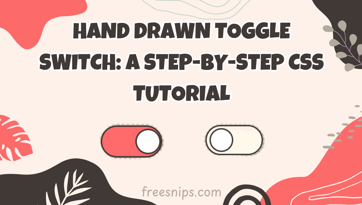
Crafting a Hand Drawn Toggle Switch: A Step-by-Step CSS Tutorial
Want to add a playful and unique element to your website? This tutorial will guide you through creating a charming hand drawn toggle switch using only HTML and CSS. This simple yet engaging UI component can be used for various purposes, like switching themes or toggling settings, adding a delightful interactive touch to your user experience.
Introduction
Have you ever wanted to add a playful, hand-drawn vibe to your website’s dark mode toggle? In this tutorial, we’ll walk through building a “sketch” toggle switch that feels like it was sketched on paper. You’ll learn how to structure your files, craft semantic HTML, style everything with a sketchy CSS filter, and add smooth animations—all without JavaScript. Whether you’re a seasoned frontend developer or a curious beginner, this guide will help you add a unique interactive element to your project.
HTML Structure
The HTML structure for our sketch toggle switch is quite simple. We’ll need a container, an input element of type “checkbox,” and a label to visually represent the switch:
<div class="toggle-container">
    <input type="checkbox" id="sketchToggle" class="toggle-input" aria-label="Dark mode toggle">
    <label for="sketchToggle" class="toggle-switch">
        <span class="toggle-handle"></span>

        <svg class="icon sun" viewBox="0 0 24 24">
            <path d="M12 3V1m0 22v-2m9-9h2M1 12h2m15.364-6.364l1.414-1.414M4.222 19.778l1.414-1.414M12 18a6 6 0 100-12 6 6 0 000 12z"/>
        </svg>

        <svg class="icon moon" viewBox="0 0 24 24">
            <path d="M20 12a8 8 0 11-15.418-3C7 9 9 8 12 8c3 0 5 1 7.582 1A8 8 0 0120 12z"/>
        </svg>
    </label>
</div>

<svg style="display: none;">
    <filter id="sketchFilter">
        <feTurbulence type="fractalNoise" baseFrequency="0.015" numOctaves="2" result="noise"/>
        <feDisplacementMap in="SourceGraphic" in2="noise" scale="1.8" xChannelSelector="R" yChannelSelector="B"/>
    </filter>
</svg>.toggle-container: This div acts as a wrapper for the entire toggle switch, allowing us to apply the sketch filter to all its child elements..toggle-input: This is the actual checkbox input. We visually hide it using CSS but keep it for its functionality and accessibility. Thearia-labelattribute is crucial for screen readers..toggle-switch: This label is styled to look like the switch itself. Theforattribute links it to the checkbox, making the label clickable to toggle the input..toggle-handle: This span will be styled as the draggable part of the switch..icon.sunand.icon.moon: These SVG elements represent the visual states of the toggle switch (e.g., light mode and dark mode).- SVG Filter: This hidden SVG contains the filter definition (
sketchFilter) that creates the hand-drawn effect.
CSS Styling
:root {
/* Color Scheme */
--primary-accent: #ff6b6b;
--secondary-accent: #ffd700;
--ink-color: #3a3633;
--paper-color: #fff9ec;
--handle-color: #ffffff;
--bg-color: #f0e6d3;
--label-positive: #ff6b6b;
--label-negative: #3a3633;
--shadow-color: rgba(0, 0, 0, 0.1);
--sketch-intensity: 1.8;
}
body {
display: flex;
justify-content: center;
align-items: center;
min-height: 100vh;
margin: 0;
background: var(--bg-color);
font-family: 'Caveat', cursive; /* Adds to the hand-drawn feel */
}
.toggle-container {
position: relative;
filter: url(#sketchFilter); /* Apply the sketch filter */
}
.toggle-input {
position: absolute;
opacity: 0;
width: 0;
height: 0;
}
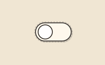
.toggle-switch {
position: relative;
display: block;
width: 120px;
height: 60px;
cursor: pointer;
background: var(--paper-color);
border-radius: 35px;
border: 3px solid var(--ink-color);
transition: all 0.4s cubic-bezier(0.23, 1, 0.32, 1);
box-shadow: 4px 4px 0 var(--shadow-color);
}
.toggle-switch::before {
content: '';
position: absolute;
top: -6px;
left: -6px;
right: -6px;
bottom: -6px;
border: 2px dashed var(--ink-color); /* Dashed border for sketchiness */
border-radius: 40px;
opacity: 0.3;
}
.toggle-handle {
position: absolute;
left: 6px;
top: 50%;
transform: translateY(-50%);
width: 46px;
height: 46px;
background: var(--handle-color);
border: 3px solid var(--ink-color);
border-radius: 50%;
transition: all 0.4s cubic-bezier(0.175, 0.885, 0.32, 1.275);
z-index: 2;
overflow: hidden;
}
.toggle-handle::after {
content: '';
position: absolute;
top: -3px;
left: -3px;
right: -3px;
bottom: -3px;
border: 2px dotted var(--ink-color); /* Dotted border for more sketchiness */
border-radius: 50%;
opacity: 0.3;
}
.icon {
position: absolute;
top: 50%;
transform: translateY(-50%);
transition: all 0.4s ease;
width: 28px;
height: 28px;
stroke: var(--ink-color);
stroke-width: 2.5;
fill: none;
stroke-linecap: round;
stroke-dasharray: 50;
stroke-dashoffset: 50;
animation: drawIn 0.8s ease-out forwards; /* Animates the icon drawing */
}
.sun {
left: 15px;
opacity: 1;
}
.moon {
right: 15px;
opacity: 0;
stroke-dasharray: 45;
}
@keyframes drawIn {
to { stroke-dashoffset: 0; }
}
@keyframes wobble {
0%, 100% { transform: translateY(-50%) rotate(0deg); }
25% { transform: translateY(-50%) rotate(12deg); }
50% { transform: translateY(-50%) rotate(-8deg); }
75% { transform: translateY(-50%) rotate(4deg); }
}
.toggle-input:checked ~ .toggle-switch {
background: var(--primary-accent); /* Change background when checked */
}
.toggle-input:checked ~ .toggle-switch .toggle-handle {
left: calc(100% - 52px); /* Move handle when checked */
animation: wobble 0.6s ease; /* Add a subtle wobble */
}
.toggle-input:checked ~ .toggle-switch .sun {
opacity: 0;
transform: translateY(-50%) rotate(180deg); /* Fade out and rotate sun */
}
.toggle-input:checked ~ .toggle-switch .moon {
opacity: 1;
transform: translateY(-50%) rotate(0deg); /* Fade in moon */
}
.toggle-input:focus-visible ~ .toggle-switch {
outline: 3px solid var(--ink-color); /* Add focus outline for accessibility */
outline-offset: 2px;
}
/* SVG Filter */
svg {
display: none; /* Hide the SVG filter element */
}Key aspects of the CSS:
--*Variables: We use CSS variables in the:rootto easily customize the color scheme.filter: url(#sketchFilter);: This crucial line applies the SVG filter to the.toggle-containerand all its children, creating the distorted, hand-drawn effect.- Borders: We use solid, dashed, and dotted borders with the
--ink-colorto enhance the sketch-like appearance. - Transitions: Smooth transitions are applied to the background, handle position, and icon opacity/transform for a visually appealing interaction.
- Animations: The
drawInanimation makes the sun and moon icons appear as if they are being drawn, and thewobbleanimation adds a playful touch when the switch is toggled. :checkedState: We use the:checkedpseudo-class along with the adjacent sibling selector (~) to style the toggle switch and its elements when the checkbox is checked.- Focus Styles: The
:focus-visiblepseudo-class ensures that users navigating with a keyboard see a clear focus indicator.
Code Breakdown
Let’s recap the key parts of the code:
- HTML: Provides the structural elements: the checkbox for functionality, the label for the visual switch, and SVG icons for the states. The hidden SVG defines the sketch filter.
- CSS: Styles the visual appearance of the switch, including the background, borders, handle, and icons. It also applies the SVG filter to create the sketch effect and handles the transitions and animations for the toggle action.
- SVG Filter: The
<feTurbulence>primitive generates a noise pattern, and the<feDisplacementMap>primitive uses this noise to distort the source graphic, resulting in the hand-drawn look.
Customization Tips
Here are some ways you can customize this sketch toggle switch:
- Color Scheme: Modify the CSS variables in the
:rootto change the primary and secondary accent colors, ink color, paper color, etc., to match your website’s branding. - Sketch Intensity: Adjust the
scaleattribute in the<feDisplacementMap>within the SVG filter to control how pronounced the sketch effect is. A higher value will result in more distortion. - Icons: Replace the sun and moon icons with other relevant SVG icons for different toggle functionalities. You can find many free SVG icon libraries online.
- Size: Adjust the
widthandheightof the.toggle-switchand the dimensions and positioning of the.toggle-handleand icons to create a larger or smaller switch. - Animation: Experiment with the
transitionproperties and the@keyframesrules to create different or more elaborate animations for the toggle action. - Font: The
'Caveat', cursivefont adds to the hand-drawn aesthetic. You can try other handwritten fonts or remove thefont-familyproperty for a different look.
Accessibility Considerations
While creating visually appealing elements is important, accessibility should not be overlooked:
<label for="sketchToggle">: Ensure the label is correctly associated with the checkbox using theforattribute. This allows users to click the visual switch to toggle the input.aria-label="Dark mode toggle": Provide a descriptivearia-labelattribute on the<input type="checkbox">so screen reader users understand the purpose of the toggle.:focus-visible: The provided CSS includes styles for the:focus-visiblepseudo-class, ensuring that keyboard users see a clear visual indication when the toggle switch has focus. Avoid removing these styles.- Color Contrast: Ensure sufficient color contrast between the text (if you add any labels) and the background colors for users with low vision.
Conclusion
Congratulations! You’ve successfully created a unique and engaging sketch-style toggle switch using HTML and CSS. This fun UI element can add a touch of personality to your website and enhance the user experience. Remember to consider accessibility and customize the design to perfectly match your project’s aesthetic. Happy coding!
