
Give Your Navigation a Hand-Drawn Touch: Creating Sketchy Breadcrumbs with CSS
Discover how to create a playful, hand drawn breadcrumbs navigation using only HTML and CSS. Perfect for adding personality to portfolios, blogs, or creative projects, this tutorial combines a sketchy aesthetic with modern web standards.
Introduction
Breadcrumbs are essential for website navigation, helping users understand their current location and easily navigate back to previous pages. While often simple and functional, breadcrumbs don’t have to be boring! This tutorial explores how to elevate your breadcrumbs with a distinctive, hand-drawn style. We’ll leverage custom fonts, SVG data URIs for borders and dividers, and even an SVG filter for a subtle “sketchy” effect on the entire page. Get ready to add a touch of artistic flair to your website!
Setup File Structure (Single File)
For this project, we’ll keep things simple and work within a single HTML file. You can, of course, separate the CSS into an external .css file if you prefer a more organized structure for larger projects.
<!DOCTYPE html>
<html lang="en">
<head>
    <meta charset="UTF-8">
    <meta name="viewport" content="width=device-width, initial-scale=1.0">
    <title>Sketchy Breadcrumbs 2.0</title>
    <link href="https://fonts.googleapis.com/css2?family=Nanum+Pen+Script&display=swap" rel="stylesheet">
    <link rel="stylesheet" href="css/style.css">
</head>
    <body>
    </body>
</html>
HTML Structure
The HTML for our sketchy breadcrumbs is straightforward and semantic:
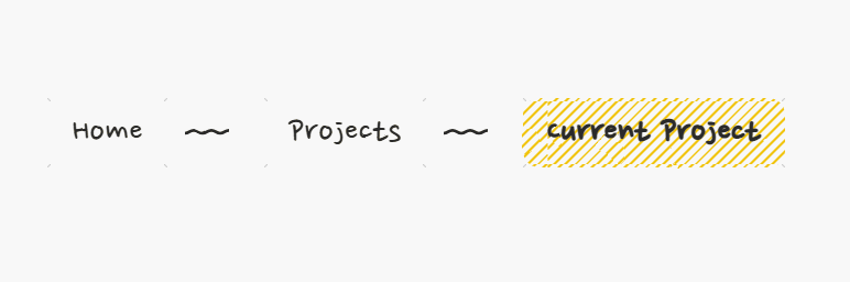
<nav aria-label="Breadcrumb navigation">
    <ul class="breadcrumb">
        <li class="breadcrumb-item"><a href="/" class="breadcrumb-link">Home</a></li>
        <li class="breadcrumb-item"><a href="/projects" class="breadcrumb-link">Projects</a></li>
        <li class="breadcrumb-item" aria-current="page"><span class="breadcrumb-link">Current Project</span></li>
    </ul>
</nav>- We use the
<nav>element with thearia-labelattribute to provide accessibility context for screen readers. - The breadcrumb items are contained within an unordered list (
<ul>) with the classbreadcrumb. - Each step in the breadcrumb is a list item (
<li>) with the classbreadcrumb-item. - For navigable links, we use the
<a>tag with the classbreadcrumb-link. - The current page is indicated with
aria-current="page"on the<li>element, and we use a<span>instead of an<a>as it’s not a clickable link.
CSS Styling
This is where the magic happens! Let’s break down the CSS rules that create the sketchy look.
:root {
    --ink-color: #2a2a2a;
    --hover-ink: #e74c3c;
    --active-underline: #f1c40f;
    --page-bg: #f8f8f8;
}

body {
    min-height: 100vh;
    margin: 0;
    display: flex;
    justify-content: center;
    align-items: center;
    background: var(--page-bg);
    filter: url(#sketchFilter); /* Apply the SVG sketch filter to the body */
}

.breadcrumb {
    display: flex;
    flex-wrap: wrap;
    gap: 1rem;
    padding: 2rem;
    list-style: none;
    font-family: 'Nanum Pen Script', cursive; /* The hand-drawn font */
    font-size: 2.2rem;
}

.breadcrumb-item {
    position: relative;
    display: flex;
    align-items: center;
}

.breadcrumb-link {
    position: relative;
    padding: 0.4rem 1.2rem;
    color: var(--ink-color);
    text-decoration: none;
    transition: all 0.3s ease;
    border: 3px solid var(--ink-color);
    border-radius: 15px;
    background: var(--page-bg);
    border-image: url("data:image/svg+xml,%3Csvg viewBox='0 0 100 100' xmlns='http://www.w3.org/2000/svg'%3E%3Cpath d='M2 2l96 96M2 98l96-96' stroke='%232a2a2a' stroke-width='3'/%3E%3C/svg%3E") 30 round; /* Sketchy border using SVG data URI */
}

.breadcrumb-item:not(:last-child)::after {
    content: '';
    width: 40px;
    height: 8px;
    margin: 0 1rem;
    background: url("data:image/svg+xml,%3Csvg xmlns='http://www.w3.org/2000/svg' viewBox='0 0 24 6'%3E%3Cpath d='M0 3c3 0 3-2 6-2s3 2 6 2 3-2 6-2 3 2 6 2' fill='none' stroke='%232a2a2a' stroke-width='2' stroke-linecap='round'/%3E%3C/svg%3E"); /* Sketchy divider using SVG data URI */
}

[aria-current] .breadcrumb-link {
    font-weight: 700;
    background-image: repeating-linear-gradient(
        -45deg,
        transparent,
        transparent 5px,
        var(--active-underline) 5px,
        var(--active-underline) 7px
    ); /* Highlight for the current page */
    animation: highlight 2s linear infinite;
}

.breadcrumb-link:hover {
    color: var(--hover-ink);
    transform: rotate(3deg) translateY(-3px); /* Subtle hover animation */
    border-color: var(--hover-ink);
}

.breadcrumb-link:hover::before {
    content: '';
    position: absolute;
    bottom: -8px;
    left: 10%;
    right: 10%;
    height: 4px;
    background: url("data:image/svg+xml,%3Csvg xmlns='http://www.w3.org/2000/svg' viewBox='0 0 24 6'%3E%3Cpath d='M0 0c2 0 3 2 5 2s3-2 5-2 3 2 5 2 3-2 5-2' fill='none' stroke='%23e74c3c' stroke-width='2' stroke-linecap='round'/%3E%3C/svg%3E"); /* Sketchy underline on hover */
    animation: squiggle 0.4s linear infinite;
}

/* Animations */
@keyframes highlight {
    0% { background-position: 0 0; }
    100% { background-position: 20px 0; }
}

@keyframes squiggle {
    from { transform: translateX(-8px); }
    to { transform: translateX(0); }
}

/* SVG sketch filter (placed within the HTML but styled here) */
svg.filter {
    position: absolute;
    width: 0;
    height: 0;
}

/* Responsive design */
@media (max-width: 768px) {
    .breadcrumb {
        font-size: 1.8rem;
        padding: 1rem;
        gap: 0.5rem;
    }

    .breadcrumb-item:not(:last-child)::after {
        width: 20px;
        margin: 0 0.5rem;
    }
}

@media (max-width: 480px) {
    .breadcrumb {
        flex-direction: column;
        align-items: flex-start;
    }

    .breadcrumb-item::after {
        transform: rotate(90deg);
    }
}
Let’s break down some of the key CSS properties:
font-family: 'Nanum Pen Script', cursive;: This imports and applies a hand-drawn style font from Google Fonts, which is crucial for the overall aesthetic.border-image: url("data:image/svg+xml,...") 30 round;: Instead of a solid border, we’re using an SVG data URI to define a diagonal line pattern that creates a sketchy border effect. Theborder-image-slice(30) andborder-image-repeat(round) control how the image is used for the border..breadcrumb-item:not(:last-child)::after: This pseudo-element adds the sketchy divider between the breadcrumb items. Again, an SVG data URI is used to create a wavy line.background-image: repeating-linear-gradient(...): For the active page, we use a repeating linear gradient to create a highlighted, underlined effect.transform: rotate(3deg) translateY(-3px);: On hover, the breadcrumb link gets a subtle rotation and translation, enhancing the interactive feel..breadcrumb-link:hover::before: This adds a wavy underline on hover, using another SVG data URI and an animation.filter: url(#sketchFilter);: This applies the SVG filter defined in the HTML to the entirebody, adding a subtle noise and displacement to give everything a slightly rough, hand-drawn look.@keyframes highlightand@keyframes squiggle: These define the animations for the active link’s background and the hover underline, respectively.@mediaqueries: These ensure the breadcrumbs adapt well to different screen sizes, stacking on smaller devices for better usability.
Customization Tips
Want to make these sketchy breadcrumbs your own? Here are a few customization ideas:
- Change the “Ink” Colors: Modify the
--ink-color,--hover-ink, and--active-underlineCSS variables to match your website’s color scheme. - Experiment with Fonts: Try other hand-drawn fonts from Google Fonts or your own collection.
- Adjust the Sketchiness:
- For the border, you can modify the
stroke-widthin the SVG data URI. - For the divider and hover underline, you can play with the
stroke-widthand thed(path definition) attribute in the SVG. - For the overall sketch effect, adjust the
baseFrequencyandscaleattributes in the<feTurbulence>and<feDisplacementMap>elements of the SVG filter. LowerbaseFrequencymeans larger “bumps,” and a higherscalemakes the displacement more pronounced.
- For the border, you can modify the
- Modify Animations: Change the animation durations, delays, or even the
transformproperties to create different interactive effects.
Accessibility Considerations
While adding visual flair is fun, it’s crucial to ensure your breadcrumbs are accessible:
- Semantic HTML: Using
<nav>andaria-labelprovides context for screen readers. - Clear Link Text: Ensure the link text accurately describes the destination page.
aria-current="page": This attribute clearly indicates the current page to assistive technologies.- Sufficient Contrast: Make sure the text color has enough contrast against the background, especially for the hover and active states.
Conclusion
Congratulations! You’ve successfully created a unique and engaging breadcrumb navigation with a hand-drawn style. By combining the power of HTML, CSS, and SVG data URIs, you can add personality and visual interest to even the most functional elements of your website. Experiment with the customization tips to truly make these sketchy breadcrumbs your own!