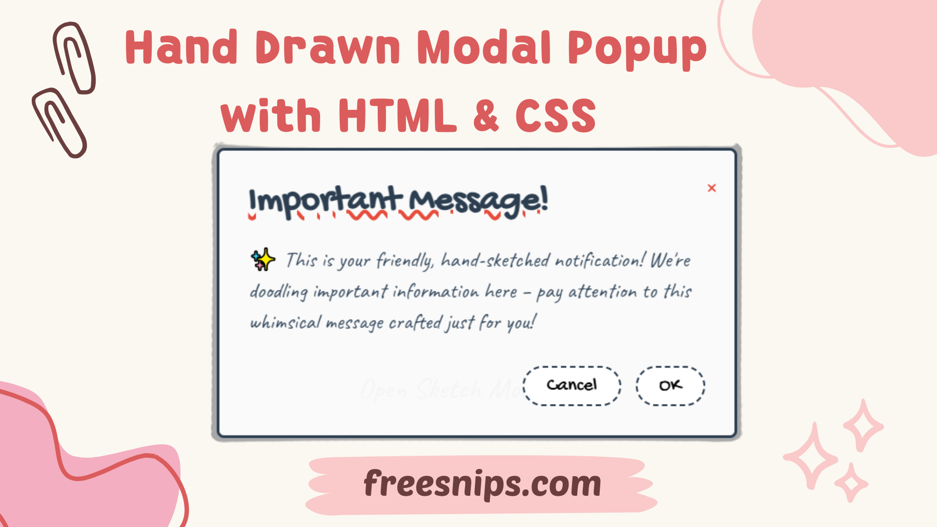
Create a Hand Drawn Modal Popup with HTML & CSS – No JavaScript Needed
In this tutorial, we’ll walk you through how to create a hand drawn modal popup using only HTML and CSS—no JavaScript required! This modal gives off a sketchy, doodle-like vibe using Google Fonts and creative styling, perfect for playful websites, portfolios, or creative projects.
Introduction
Hand-drawn design elements inject warmth and creativity into digital interfaces. In this guide, you’ll learn to create a modal dialog with a sketch-style aesthetic using only HTML and CSS, complete with wavy underlines, dashed borders, and quirky animations.
Setup File Structure (Single File)
For this project, we’ll keep things simple and work within a single HTML file. You can, of course, separate the CSS into an external .css file if you prefer a more organized structure for larger projects.
<!DOCTYPE html>
<html lang="en">
<head>
    <meta charset="UTF-8">
    <meta name="viewport" content="width=device-width, initial-scale=1.0">
    <title>Hand-Drawn Modal</title>
    <link href="https://fonts.googleapis.com/css2?family=Caveat:wght@400;700&family=Gochi+Hand&display=swap" rel="stylesheet">
    <link rel="stylesheet" href="style.css">
</head>
HTML Structure
The HTML structure is straightforward. We have a link that will trigger the modal and the modal itself, which is initially hidden.
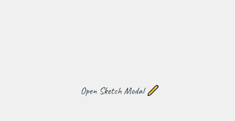
   <a href="#handmade-modal" class="modal-trigger">Open Sketch Modal ✏️</a>

    <div id="handmade-modal" class="modal">
        <div class="modal-content">
            <a href="#" class="modal-close">+</a>
            <h2 class="modal-title">Important Message!</h2>
            <p class="modal-message">
                ✨ This is your friendly, hand-sketched notification!
                We're doodling important information here – pay attention
                to this whimsical message crafted just for you!
            </p>
            <div class="modal-buttons">
                <button class="modal-button">Cancel</button>
                <button class="modal-button">OK</button>
            </div>
        </div>
</div>.modal-trigger: This link, when clicked, uses an anchor (#handmade-modal) to target and show the modal..modal: This is the main container for the modal. It’s initially hidden using CSS and becomes visible when the target in the URL matches itsid(handmade-modal)..modal-content: This div holds the actual content of the modal: the close button, title, message, and action buttons..modal-close: A link that, when clicked (targeting#), will navigate away from the modal’s target in the URL, effectively hiding it..modal-title,.modal-message,.modal-buttons,.modal-button: These are semantic classes for the different elements within the modal content.
CSS Styling (style.css or within <style> tags)
The magic of the hand-drawn look comes from the CSS. Let’s break down the key styles:
:root {
    --primary-color: #2c3e50;
    --secondary-color: #34495e;
    --accent-color: #e74c3c;
    --background-color: #f0f0f0;
    --button-hover: #f1c40f;
    --text-color: #ffffff;
}

/* Base styles for the body to center content */
body {
    min-height: 100vh;
    display: grid;
    place-items: center;
    background: var(--background-color);
    font-family: 'Caveat', cursive; /* Fun, handwritten font */
}

/* Style for the modal trigger link */
.modal-trigger {
    font-size: 2rem;
    cursor: pointer;
    color: var(--primary-color);
    text-decoration: none;
    position: relative;
    transition: all 0.3s ease;
}

.modal-trigger::after {
    content: '';
    position: absolute;
    bottom: -3px;
    left: 0;
    width: 0;
    height: 3px;
    background: var(--accent-color);
    transition: width 0.3s ease;
}

.modal-trigger:hover {
    color: var(--accent-color);
}

.modal-trigger:hover::after {
    width: 100%;
}

/* Modal overlay (the dark background) */
.modal {
    display: none; /* Hidden by default */
    position: fixed;
    top: 0;
    left: 0;
    width: 100%;
    height: 100%;
    background: rgba(0,0,0,0.3); /* Semi-transparent black */
    z-index: 1000; /* Ensure it's on top of other content */
}

/* Modal content (the white box) */
.modal-content {
    position: relative;
    margin: 5% auto; /* Center vertically and horizontally */
    width: 90%;
    max-width: 500px;
    background: rgba(255,255,255,0.95); /* Slightly transparent white */
    padding: 2rem;
    border-radius: 8px;
    animation: sketchIn 0.5s ease-out; /* Entrance animation */
    border: 3px solid var(--primary-color); /* Solid border */
}

/* Hand-drawn dashed border effect (using a pseudo-element) */
.modal-content::before {
    content: '';
    position: absolute;
    top: -10px;
    left: -10px;
    right: -10px;
    bottom: -10px;
    border: 2px dashed var(--primary-color); /* Dashed border for the sketch effect */
    border-radius: 12px; /* Slightly larger radius to go around the solid border */
    opacity: 0.3; /* Subtle effect */
}

/* Styles for the modal title */
.modal-title {
    font-family: 'Gochi Hand', cursive; /* Another handwritten font for emphasis */
    font-size: 2.5rem;
    margin: 0 0 1rem 0;
    color: var(--primary-color);
    text-decoration: underline wavy var(--accent-color); /* Wavy underline adds to the hand-drawn feel */
}

/* Style for the modal message */
.modal-message {
    font-size: 1.5rem;
    line-height: 1.4;
    color: var(--secondary-color);
    margin-bottom: 2rem;
}

/* Container for the buttons */
.modal-buttons {
    display: flex;
    gap: 1rem;
    justify-content: flex-end; /* Align buttons to the right */
}

/* Style for the action buttons */
.modal-button {
    padding: 0.5rem 1.5rem;
    font-family: 'Gochi Hand', cursive;
    font-size: 1.3rem;
    background: none;
    border: 2px dashed var(--primary-color); /* Dashed border for buttons too */
    border-radius: 30px; /* Rounded buttons */
    cursor: pointer;
    transition: all 0.3s ease;
    position: relative;
    background: rgba(255,255,255,0.9); /* Slightly transparent background */
}

.modal-button:hover {
    background: var(--button-hover);
    border-style: solid; /* Change border to solid on hover */
    transform: rotate(-2deg); /* Slight rotation on hover */
    box-shadow: 3px 3px 0 rgba(0,0,0,0.2); /* Subtle shadow on hover */
}

/* Entrance animation for the modal content */
@keyframes sketchIn {
    0% {
        opacity: 0;
        transform: translateY(-30px) rotate(3deg);
    }
    60% {
        transform: translateY(10px) rotate(-2deg);
    }
    100% {
        opacity: 1;
        transform: translateY(0) rotate(0);
    }
}

/* Style for the close button */
.modal-close {
    position: absolute;
    top: 1rem;
    right: 1rem;
    font-size: 2rem;
    cursor: pointer;
    transform: rotate(45deg); /* Creates the 'X' shape */
    color: var(--accent-color);
    transition: transform 0.3s ease;
    text-decoration: none; /* Remove default link underline */
}

.modal-close:hover {
    transform: rotate(135deg); /* Further rotation on hover */
}

/* Show the modal when the target in the URL matches its ID */
.modal:target {
    display: block;
}

/* Responsive adjustments for smaller screens */
@media (max-width: 480px) {
    .modal-content {
        padding: 1.5rem;
    }
    .modal-title {
        font-size: 2rem;
    }
    .modal-message {
        font-size: 1.2rem;
    }
}:root: Defines CSS variables for consistent theming.body: Sets up a centered layout and applies the main handwritten font ('Caveat')..modal-trigger: Styles the link that opens the modal, including a subtle animated underline on hover..modal: Initially hidden (display: none;), it becomes visible when targeted.position: fixed;ensures it covers the entire viewport..modal-content: The main container for the modal’s content. It’s centered, has a white background, padding, rounded corners, a solid border, and an entrance animation (sketchIn)..modal-content::before: This is the key to the hand-drawn effect! Adashedborder with a slightly largerborder-radiusis placed behind the solid border, creating the illusion of a sketch. Theopacityis reduced to make it subtle..modal-title: Uses another handwritten font ('Gochi Hand') and awavyunderline for added character..modal-button: Styled with adashedborder and rounded corners to match the overall theme. Hover effects include a background color change, a solid border, a slight rotation, and a shadow.@keyframes sketchIn: A simple animation that makes the modal appear to be sketched in with a slight bounce and rotation..modal-close: Styled to look like a plus sign that rotates into an ‘X’. Hovering makes it rotate further..modal:target: This CSS pseudo-class is crucial for showing the modal when the URL fragment identifier (the#handmade-modalpart) matches the modal’sid.@media (max-width: 480px): Basic responsive adjustments for smaller screens to ensure readability.
Customization Tips
- Fonts: Experiment with different handwritten fonts from Google Fonts or other sources to find the perfect style.
- Colors: Modify the CSS variables in the
:rootto match your website’s branding. - Border Styles: Try different
border-stylevalues (e.g.,dotted,double) or even use a subtle background image on the border for a more unique look. - Animation: Adjust the
sketchInanimation or create your own custom animations for the modal’s appearance and disappearance. - Content: Naturally, you can put any HTML content you need inside the
.modal-contentdiv, such as forms, images, or more detailed text. - Button Actions: You’ll likely want to add JavaScript event listeners to the “Cancel” and “OK” buttons to perform specific actions when they are clicked.
Accessibility Considerations
While this modal provides a unique visual style, it’s important to consider accessibility:
- Keyboard Navigation: Ensure users can navigate into and out of the modal using the keyboard (Tab key). For more complex modals, you might need to use JavaScript to manage focus.
- ARIA Attributes: For more complex modal interactions, consider using ARIA attributes (like
aria-modal="true",aria-labelledby,aria-describedby) to provide screen readers with more context about the modal’s purpose and content. - Contrast: Ensure sufficient color contrast between the text and background colors for readability.
- Clear Focus Styles: Make sure the focusable elements (like the close button and the action buttons) have clear visual focus indicators.
Conclusion
With just HTML and CSS, you’ve built a fully functional, beautifully sketch-styled modal popup that grabs attention in a friendly, creative way. It’s lightweight, responsive, and perfect for quirky personal websites or creative portfolios. Give it a try and make it your own!
