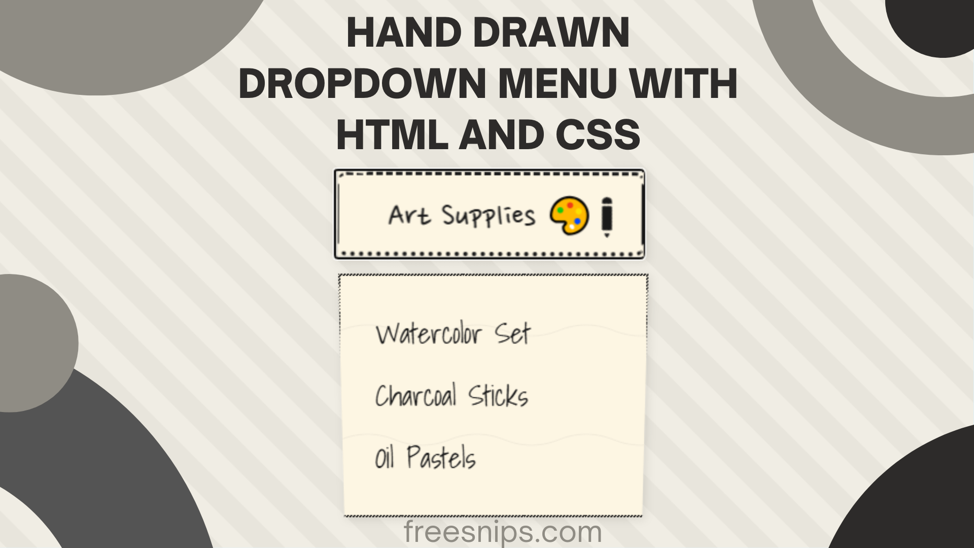
How to Create a Hand Drawn Dropdown Menu with HTML and CSS
Want to add a fun, handmade feel to your website’s user interface? This tutorial walks you through building a hand drawn dropdown menu using only HTML and CSS—no JavaScript required! We’ll use custom fonts, CSS animations, and creative styling to craft an artistic dropdown perfect for creative portfolios, personal blogs, or art-related sites.
Introduction
Tired of the same old boring dropdown menus? Want to inject some creative flair into your user interface? Then you’re in the right place! This guide will walk you through the steps of building an “Artistic Dropdown” – a custom dropdown menu styled to resemble a hand-drawn sketch on paper. We’ll leverage the power of CSS to create this distinctive look, from the paper-like background to the quirky borders and the little pencil icon.
Setup File Structure (Single File)
For this project, we’ll keep things simple and work within a single HTML file. You can, of course, separate the CSS into an external .css file if you prefer a more organized structure for larger projects.
<!DOCTYPE html>
<html lang="en">
<head>
    <meta charset="UTF-8">
    <meta name="viewport" content="width=device-width, initial-scale=1.0">
    <title>Artistic Dropdown 3.0</title>
    <link href="https://fonts.googleapis.com/css2?family=Nanum+Pen+Script&family=Shadows+Into+Light&display=swap" rel="stylesheet">
    <style>
        /* Your CSS code will go here */
    </style>
</head>
     <body>
    </body>
</html>
Simply paste the provided HTML and CSS code into this structure.
HTML Structure
Here’s the HTML structure to define the dropdown:
<div class="art-dropdown" tabindex="0">
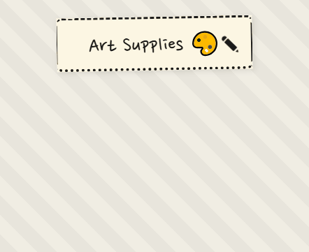
<button class="trigger" aria-haspopup="true">Art Supplies 🎨</button>
<div class="options-container">
<ul class="options-list" role="menu">
<li class="option" role="menuitem">Watercolor Set</li>
<li class="option" role="menuitem">Charcoal Sticks</li>
<li class="option" role="menuitem">Oil Pastels</li>
</ul>
</div>
</div>- A
<button>element with the classtrigger. This is the visible button that users will click to open the dropdown. It uses thearia-haspopup="true"attribute to indicate that it controls a popup menu. - A
divwith the classoptions-container. This will hold the list of dropdown options. Initially, itsmax-heightwill be set to 0 to hide the options. - An unordered list
<ul>with the classoptions-listand therole="menu"attribute, containing the individual dropdown items as<li>elements with the classoptionandrole="menuitem".
CSS Styling
 :root {
            --ink: #1a1a1a;
            --paper: #fdf6e3;
            --highlight: #fff3b8;
            --roughness: 3px;
            --sketch-speed: 0.4s;
        }

        body {
            min-height: 100vh;
            display: grid;
            place-items: center;
            margin: 0;
            background: repeating-linear-gradient(
                45deg,
                #f0ede4,
                #f0ede4 20px,
                #e8e5dc 20px,
                #e8e5dc 40px
            );
            font-family: 'Shadows Into Light', cursive;
        }

        .art-dropdown {
            position: relative;
            width: min(90%, 280px);
            filter: drop-shadow(2px 2px 4px rgba(0,0,0,0.1));
        }

        .trigger {
            width: 100%;
            padding: 1rem 2.5rem;
            font-size: 2rem;
            background: var(--paper);
            border: none;
            cursor: pointer;
            position: relative;
            font-family: 'Nanum Pen Script', cursive;
            color: var(--ink);
            transform: rotate(-1deg);
            transition: all var(--sketch-speed) ease;
        }

        .trigger:hover {
            transform: rotate(0.5deg) translateY(-2px);
            animation: sketch-shake 0.8s ease infinite;
        }

        .trigger::before {
            content: '';
            position: absolute;
            inset: 0;
            border: 3px dashed var(--ink);
            border-radius: 8px;
            border-style: dashed solid dotted double;
            border-width: 3px 2px 4px 1px;
            clip-path: polygon(
                0 8%, 2% 0, 8% 2%, 10% 0,
                98% 0, 100% 5%, 98% 10%, 100% 15%,
                100% 85%, 98% 90%, 100% 95%, 98% 100%,
                2% 100%, 0 95%, 2% 90%, 0 85%,
                0 15%, 2% 10%, 0 5%, 2% 0
            );
        }

        .trigger::after {
            content: "✎";
            position: absolute;
            right: 1rem;
            top: 50%;
            transform: translateY(-50%);
            transition: all var(--sketch-speed) ease;
        }

        .options-container {
            position: absolute;
            width: 100%;
            margin-top: 1rem;
            background: var(--paper);
            max-height: 0;
            overflow: hidden;
            transition: max-height 0.6s cubic-bezier(0.4, 0, 0.2, 1);
            clip-path: polygon(0 0, 100% 0, 100% 0, 0 0);
            border-image: repeating-linear-gradient(
                135deg,
                var(--ink),
                var(--ink) 5px,
                transparent 5px,
                transparent 10px
            ) 10 round;
            border-width: 2px;
            border-style: solid;
        }

        .art-dropdown:focus-within .options-container,
        .art-dropdown:hover .options-container {
            max-height: 500px;
            clip-path: polygon(0 0, 100% 0, 98% 100%, 2% 100%);
        }

        .art-dropdown:focus-within .trigger::after,
        .art-dropdown:hover .trigger::after {
            transform: translateY(-50%) rotate(45deg) scale(1.2);
        }

        .options-list {
            list-style: none;
            padding: 1.5rem 0;
            margin: 0;
            position: relative;
        }

        .options-list::before {
            content: "";
            position: absolute;
            inset: 0;
            background: url('data:image/svg+xml;utf8,<svg width="100" height="100" xmlns="http://www.w3.org/2000/svg"><path d="M0 50 Q25 40 50 50 T100 50" stroke="%231a1a1a" fill="none" stroke-width="0.5" opacity="0.1"/></svg>');
        }

        .option {
            padding: 0.5rem 2rem;
            font-size: 1.6rem;
            color: var(--ink);
            cursor: pointer;
            position: relative;
            transition: all var(--sketch-speed) ease;
            opacity: 0;
            transform: translateX(-20px);
        }

        .art-dropdown:hover .option {
            opacity: 1;
            transform: translateX(0);
        }

        .option:hover {
            background: var(--highlight);
        }

        .option:hover::before {
            content: "";
            position: absolute;
            left: -10px;
            top: 50%;
            width: 24px;
            height: 24px;
            border: 2px solid var(--ink);
            border-radius: 50%;
            animation: doodle-circle 0.6s ease forwards;
        }

        .option:nth-child(1) { transition-delay: 0.1s }
        .option:nth-child(2) { transition-delay: 0.2s }
        .option:nth-child(3) { transition-delay: 0.3s }
        .option:nth-child(4) { transition-delay: 0.4s }

        @keyframes sketch-shake {
            0%, 100% { transform: rotate(-0.5deg) translateX(0) }
            25% { transform: rotate(1deg) translateX(-2px) }
            75% { transform: rotate(-1deg) translateX(2px) }
        }

        @keyframes doodle-circle {
            0% { clip-path: circle(0% at 50% 50%) }
            100% { clip-path: circle(100% at 50% 50%) }
        }

        @media (max-width: 480px) {
            .trigger {
                font-size: 1.8rem;
                padding: 0.8rem 2rem;
            }

            .option {
                font-size: 1.4rem;
                padding: 0.8rem 1.5rem;
            }
        }
Let’s break down the key styling elements:
body: Sets a paper-like background with a subtle diagonal striped pattern usingrepeating-linear-gradient. It also centers the dropdown on the page and sets a cursive font..art-dropdown: Acts as the main wrapper, setting a relative position and a maximum width for responsiveness. Thefilter: drop-shadowadds a subtle shadow..trigger: This styles the main button. It has a paper-like background, a larger font size with a hand-drawn font (Nanum Pen Script), a dark text color, and a slight initial rotation. The:hoverstate adds a subtle rotation and vertical movement, along with a shaking animation..trigger::before: This creates the dashed border effect around the button using a pseudo-element with a combination of different border styles and widths. Theclip-pathproperty gives it the irregular, torn-paper look..trigger::after: This adds the pencil “✎” icon on the right side of the button, with a transition for a smooth rotation effect when the dropdown is hovered or focused..options-container: This is initially hidden withmax-height: 0andoverflow: hidden. Thetransitionproperty ensures a smooth unfolding animation. Theclip-pathis used to initially hide and then reveal the options with a slight angled effect. Theborder-imagecreates the stitched or hand-drawn border effect using a repeating gradient..art-dropdown:focus-within .options-container,.art-dropdown:hover .options-container: These rules control the display of the options when the dropdown container is either focused (e.g., by tabbing) or hovered over. They increase themax-heightand adjust theclip-pathto reveal the options..art-dropdown:focus-within .trigger::after,.art-dropdown:hover .trigger::after: These rotate and scale the pencil icon when the dropdown is active..options-list: Removes default list styling and adds a subtle wavy line pattern in the background using a::beforepseudo-element with an SVG data URL..option: Styles each individual dropdown item with padding, a hand-drawn font, dark text color, and a pointer cursor. They are initially hidden and slightly translated to the left with a transition for a staggered reveal effect on hover..art-dropdown:hover .option: This makes the options visible and moves them to their final position when the dropdown is hovered..option:hover: Provides a highlight effect on hover..option:hover::before: Adds a circular “doodle” animation on the left of the hovered option..option:nth-child(n): These rules add a slight delay to the appearance of each option, creating a cascading effect.@keyframes sketch-shake: Defines the shaking animation for the trigger button on hover.@keyframes doodle-circle: Defines the circular reveal animation for the doodle on the hovered option.@media (max-width: 480px): Adjusts font sizes and paddings for smaller screens to ensure responsiveness.
Accessibility Considerations
While this dropdown uses some basic ARIA attributes, here are a few more things to keep in mind for better accessibility:
- Keyboard Navigation: Ensure users can navigate through the options using the keyboard (arrow keys, Enter to select). This might require adding JavaScript.
- Focus Management: When the dropdown opens, ensure focus is appropriately managed within the options. When it closes, focus should return to the trigger button.
- Contrast: Ensure sufficient color contrast between the text and background for readability.
Conclusion
Congratulations! You’ve successfully created a unique and artistic hand drawn dropdown menu using HTML and CSS. This stylish component can add a personal and creative touch to your web projects. Remember to consider accessibility for all users and feel free to customize the styles further to match your artistic vision!