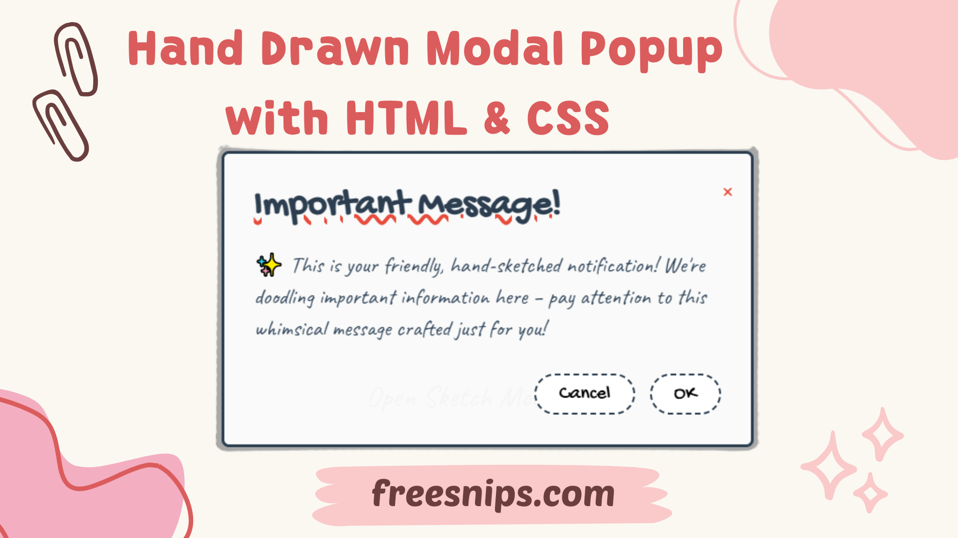

DIY Hand Drawn Radio Buttons: A Step-by-Step CSS Guide
Creating playful and hand drawn radio buttons can bring a fun, hand-crafted feel to your website UI. In this guide, we’ll walk through how to create a stylized group of radio buttons using only HTML and CSS — no JavaScript required. These buttons feature a scribbled outline, animated selections, and a noise texture that gives them a hand-drawn look.
Let’s break it down step by step.
Introduction
In a world of clean and often minimalist web design, sometimes adding a touch of personality can make your site stand out. These sketch-style radio buttons achieve just that, giving your users a more engaging and memorable experience. We’ll explore how CSS, including some clever SVG filters, can transform standard radio buttons into something truly special. This style works great for creative portfolios, kid-focused apps, or anywhere a playful design is welcome.
Setup File Structure (Separate Files)
While the provided code is a single HTML file for simplicity, in a real-world project, it’s good practice to separate your HTML and CSS.
index.html: Contains the main HTML structure.style.css: Holds all the CSS rules for styling.
You would then link your style.css file in the <head> section of your index.html:
<head>
    <meta charset="UTF-8">
    <meta name="viewport" content="width=device-width, initial-scale=1.0">
    <title>Sketch-Style Radio Buttons</title>
    <link href="https://fonts.googleapis.com/css2?family=Caveat:wght@400;700&display=swap" rel="stylesheet">
    <link rel="stylesheet" href="style.css">
</head>
And your style.css would contain all the <style> block content from the original code.
HTML Structure
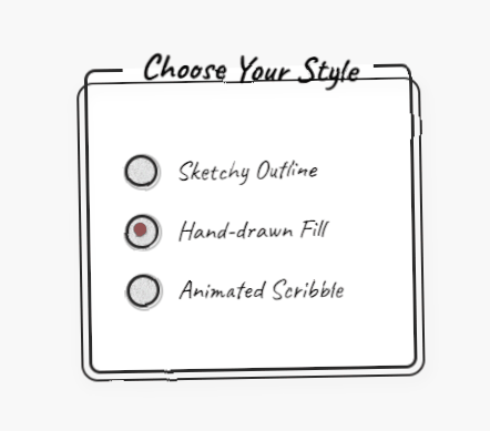
The HTML is straightforward, using a <fieldset> to group the radio buttons and a <legend> for the title. Each radio button consists of an <input> element of type “radio” and a corresponding <label>. We’ve added a <span> with the class custom-radio inside the label to style our unique radio button appearance.
<fieldset class="radio-group">
    <legend>Choose Your Style</legend>

    <div class="radio-wrapper">
        <input class="radio-input" type="radio" name="style" id="option1">
        <label class="radio-label" for="option1">
            <span class="custom-radio"></span>
            Sketchy Outline
        </label>
    </div>

    <div class="radio-wrapper">
        <input class="radio-input" type="radio" name="style" id="option2">
        <label class="radio-label" for="option2">
            <span class="custom-radio"></span>
            Hand-drawn Fill
        </label>
    </div>

    <div class="radio-wrapper">
        <input class="radio-input" type="radio" name="style" id="option3">
        <label class="radio-label" for="option3">
            <span class="custom-radio"></span>
            Animated Scribble
        </label>
    </div>
</fieldset>

<svg>
    <filter id="sketch">
        <feTurbulence type="fractalNoise" baseFrequency="0.02" numOctaves="1" result="noise"/>
        <feDisplacementMap in="SourceGraphic" in2="noise" scale="3" xChannelSelector="R" yChannelSelector="B"/>
    </filter>
</svg>
<fieldset class="radio-group">: This element groups related form controls. The radio-group class will be styled to look like a hand-drawn box. <legend>: Provides a caption for the <fieldset>. We’ve styled it with a playful rotation. <div class="radio-wrapper">: This acts as a container for each radio button and its label, providing spacing. <input class="radio-input" type="radio" name="style" id="option1">: The actual radio button input. It’s visually hidden using CSS. The name="style" attribute ensures that only one option within this group can be selected. The id attribute links it to its corresponding label. <label class="radio-label" for="option1">: This label is what the user will interact with. The for attribute links it to the specific radio input’s id, making the label clickable to select the radio button. <span class="custom-radio"></span>: This empty <span> is the element we’ll style to create the custom sketch-style radio button visual. <svg> and <filter id="sketch">: This SVG code defines a filter that creates the sketch effect. It uses <feTurbulence> to generate noise and <feDisplacementMap> to distort the visual based on that noise.
CSS Styling
The magic is in the CSS. Here’s what we’re doing:
:root {
            --primary: #2a2a2a;
            --accent: #ff5757;
            --bg: #f8f8f8;
            --ink-effect: url("data:image/svg+xml,%3Csvg viewBox='0 0 300 300' xmlns='http://www.w3.org/2000/svg'%3E%3Cfilter id='noiseFilter'%3E%3CfeTurbulence type='fractalNoise' baseFrequency='0.85' numOctaves='3' stitchTiles='stitch'/%3E%3C/filter%3E%3Crect width='100%25' height='100%25' filter='url(%23noiseFilter)'/%3E%3C/svg%3E");
        }

        body {
            display: flex;
            justify-content: center;
            align-items: center;
            min-height: 100vh;
            margin: 0;
            background: var(--bg);
            font-family: 'Caveat', cursive;
        }

        .radio-group {
            max-width: 400px;
            padding: 2rem;
            border: 3px solid var(--primary);
            border-radius: 10px;
            position: relative;
            background: white;
            transform: rotate(-1deg);
        }

        .radio-group::after {
            content: '';
            position: absolute;
            top: -10px;
            left: -10px;
            right: -10px;
            bottom: -10px;
            border: 2px solid var(--primary);
            border-radius: 15px;
            z-index: -1;
            filter: drop-shadow(2px 4px 6px rgba(0,0,0,0.1));
        }

        legend {
            font-size: 2rem;
            font-weight: 700;
            padding: 0 1rem;
            transform: rotate(2deg);
        }

        .radio-wrapper {
            margin: 1.5rem 0;
            position: relative;
        }

        .radio-input {
            position: absolute;
            opacity: 0;
        }

        .radio-label {
            display: flex;
            align-items: center;
            font-size: 1.5rem;
            cursor: pointer;
            transition: transform 0.2s ease;
        }

        .radio-label:hover {
            transform: translateX(5px);
        }

        .custom-radio {
            width: 24px;
            height: 24px;
            border: 3px solid var(--primary);
            border-radius: 50%;
            margin-right: 1rem;
            position: relative;
            transition: all 0.3s ease;
            background-image: var(--ink-effect);
            background-blend-mode: multiply;
        }

        .custom-radio::before {
            content: '';
            position: absolute;
            width: calc(100% + 6px);
            height: calc(100% + 6px);
            border: 2px solid var(--primary);
            border-radius: 50%;
            top: -4px;
            left: -4px;
            transform: rotate(5deg);
            opacity: 0.3;
        }

        .radio-input:checked + .radio-label .custom-radio::after {
            content: '';
            position: absolute;
            top: 4px;
            left: 4px;
            width: 12px;
            height: 12px;
            background: var(--accent);
            border-radius: 50%;
            animation: sketchIn 0.3s ease-out;
            box-shadow: 1px 1px 2px rgba(0,0,0,0.2);
        }

        .radio-input:focus-visible + .radio-label .custom-radio {
            outline: 2px dashed var(--accent);
            outline-offset: 2px;
        }

        @keyframes sketchIn {
            from {
                transform: scale(0) rotate(45deg);
                opacity: 0;
            }
            to {
                transform: scale(1) rotate(0);
                opacity: 1;
            }
        }

        /* Hand-drawn effects */
        .radio-group, .custom-radio, legend {
            filter: url(#sketch);
        }

        /* SVG filter for sketch effect */
        svg {
            position: absolute;
            width: 0;
            height: 0;
        }
Let’s break down the key parts:
--primary,--accent,--bg,--ink-effect: These CSS variables define the color scheme and a reusable SVG data URL for a subtle ink-like texture.body: Basic styling to center the content and set the background and font. Thefont-family: 'Caveat', cursive;is crucial for the hand-drawn feel..radio-group: Styles the container with a border, background, slight rotation, and a pseudo-element (::after) to create a layered, slightly offset outline, enhancing the sketch look. Adrop-shadowadds a bit of depth.legend: Styles the title with a larger font size, bold weight, and a small rotation to match the hand-drawn aesthetic..radio-wrapper: Provides vertical spacing between the radio button options..radio-input: This is important for accessibility but is visually hidden usingopacity: 0;..radio-label: Styles the label text, aligns it with the custom radio button, and sets the cursor topointer. Thetransitionand:hovereffect provide subtle feedback..custom-radio: This is where the custom styling of the radio button happens. It’s styled as a circle with a border and the ink-effect background. The::beforepseudo-element adds another slightly offset circle to further the sketch illusion..radio-input:checked + .radio-label .custom-radio::after: When a radio button is checked, this styles a filled circle inside the custom radio button with the accent color. ThesketchInanimation adds a playful appearance..radio-input:focus-visible + .radio-label .custom-radio: Provides a clear focus indicator for accessibility when the radio button is navigated using the keyboard.@keyframes sketchIn: Defines the animation for the checked state, making the fill appear with a slight rotation and scaling effect..radio-group, .custom-radio, legend { filter: url(#sketch); }: This is the key to the sketch effect! It applies the SVG filter we defined earlier to the radio group container, the custom radio button, and the legend, giving them that hand-drawn, slightly wobbly appearance.svg { position: absolute; width: 0; height: 0; }: This hides the SVG filter from being displayed on the page.
Customization Tips
- Color Scheme: Modify the
--primaryand--accentCSS variables to match your brand or desired aesthetic. - Sketch Intensity: Adjust the
baseFrequencyandscalevalues in the<feTurbulence>and<feDisplacementMap>filters within the SVG to control the intensity of the sketch effect. LowerbaseFrequencyand higherscalewill generally result in a more pronounced wobble. - Ink Effect: You can change the color within the
fillattribute of the<rect>element in the--ink-effectdata URL to alter the subtle texture. - Font: Experiment with other hand-drawn fonts from Google Fonts or your own collection.
- Animation: Tweak the
sketchInanimation or add other animations for different interactions.
Accessibility Considerations
<label>association: Ensure each<input type="radio">has a correctly associated<label>using theforattribute. This is crucial for screen readers and users who rely on keyboard navigation.- Focus Styles: The
:focus-visiblestyle on the.custom-radioensures that keyboard users can clearly identify the currently focused radio button. - Clear Labels: The text within the
<label>should clearly describe the option it represents.
Conclusion
These sketch-style radio buttons offer a fun and distinctive way to enhance your web forms. By leveraging the power of CSS and SVG filters, you can move beyond standard form elements and create a more engaging and memorable user experience. Experiment with the customization options to perfectly match your website’s style and remember to prioritize accessibility for all users.