
How to Create a Hand-Drawn Sketch Button with HTML & CSS
Buttons are the gateway to user interaction on any website. In this tutorial, you’ll learn how to build a playful sketch button that animates a hand-drawn border on hover. We’ll rely solely on HTML and CSS—no JavaScript required—making it lightweight, accessible, and easy to customize.
Introduction
In a world of sleek and polished interfaces, sometimes a little bit of imperfection can make your design stand out. This sketch button effect achieves just that, giving a hand-drawn, organic feel to a simple call-to-action. We’ll leverage the power of SVG and CSS animations to bring this effect to life without relying on any JavaScript.
HTML Structure
<div class="btn-container">
<button class="sketch-btn">
<svg class="sketch-border" viewBox="0 0 200 60">
<path class="top"/>
<path class="right"/>
<path class="bottom"/>
<path class="left"/>
</svg>
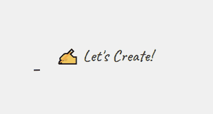
✍️ Let’s Create!
</button>
</div>.btn-containercenters the button on the page..sketch-btnholds both the label and the SVG border.- The four
<path>elements inside the SVG form the top, right, bottom, and left edges.
CSS Styling
We use custom properties and transitions to achieve the sketch effect:
 .btn-container {
            display: flex;
            justify-content: center;
            align-items: center;
            min-height: 100vh;
            background: #f0f0f0;
        }

        .sketch-btn {
            position: relative;
            padding: 1rem 2rem;
            font-size: 1.5rem;
            background: none;
            border: none;
            cursor: pointer;
            font-family: 'Caveat', cursive;
            color: #333;
            transition: color 0.3s ease;
        }

        .sketch-btn:hover {
            color: #111;
        }

        .sketch-border {
            position: absolute;
            top: 0;
            left: 0;
            width: 100%;
            height: 100%;
        }

        .sketch-border path {
            fill: none;
            stroke: #333;
            stroke-width: 2;
            stroke-linecap: round;
            stroke-dasharray: 200;
            stroke-dashoffset: 200;
            transition: none;
        }

        .sketch-btn:hover .sketch-border path {
            animation: draw 0.8s linear forwards;
        }

        @keyframes draw {
            to {
                stroke-dashoffset: 0;
            }
        }

        .sketch-border path:nth-child(1) { animation-delay: 0.1s; }
        .sketch-border path:nth-child(2) { animation-delay: 0.3s; }
        .sketch-border path:nth-child(3) { animation-delay: 0.5s; }
        .sketch-border path:nth-child(4) { animation-delay: 0.7s; }

        /* Create imperfect paths */
        path.top { d: path('M 5,5 Q 30,2 95,5 T 185,8'); }
        path.right { d: path('M 195,10 Q 198,30 195,45 T 193,55'); }
        path.bottom { d: path('M 185,55 Q 160,58 40,57 T 8,52'); }
        path.left { d: path('M 5,50 Q 3,35 7,15 T 10,8'); }

        /* Add subtle shadow animation */
        .sketch-btn:hover {
            filter: drop-shadow(0 2px 4px rgba(0,0,0,0.1));
            transform: translateY(-2px);
            transition: all 0.3s ease;
        }
Let’s break down the key CSS rules:
.btn-container: Centers the button on the page using Flexbox..sketch-btn:position: relative;: This is important as we’ll be positioning the SVG border absolutely within it.padding,font-size,background,border,cursor,font-family,color: These styles give the button its basic appearance. We’ve used the “Caveat” font for that hand-drawn feel.transition: color 0.3s ease;: A smooth transition for the text color on hover.
.sketch-btn:hover:color: #111;: Darkens the text on hover.filter: drop-shadow(...): Adds a subtle shadow for a bit of depth on hover.transform: translateY(-2px);: Slightly moves the button up on hover.transition: all 0.3s ease;: Smooth transition for the shadow and transform.
.sketch-border:position: absolute; top: 0; left: 0; width: 100%; height: 100%;: This ensures the SVG border sits directly on top of the button content and spans its entire area.
.sketch-border path:fill: none;: We only want to see the stroke, not a filled shape.stroke: #333;: Sets the color of the border lines.stroke-width: 2;: Defines the thickness of the border.stroke-linecap: round;: Makes the ends of the lines rounded for a softer look.stroke-dasharray: 200;: This is the magic! It creates a dashed line effect where the length of the dashes and the gaps are both 200 units. Since this is longer than the path length, the entire path initially appears invisible.stroke-dashoffset: 200;: This offsets the starting point of the dashes by 200 units, effectively hiding the entire border.transition: none;: We don’t want any default transitions on the path properties; the animation will handle the visual change.
.sketch-btn:hover .sketch-border path:animation: draw 0.8s linear forwards;: This applies thedrawanimation to the SVG paths when the button is hovered. The animation will run for 0.8 seconds, at a constant speed (linear), and the final state of the animation will be maintained (forwards).
@keyframes draw: This defines thedrawanimation. It simply animates thestroke-dashoffsetfrom its initial value (200) to 0. As the offset decreases, the dashes become visible, creating the drawing effect..sketch-border path:nth-child(1) { animation-delay: 0.1s; }etc.: These rules add a slight delay to the start of the animation for each of the four paths. This staggered effect makes it look like each side of the border is being drawn sequentially, enhancing the hand-drawn illusion.path.top { d: path('M 5,5 Q 30,2 95,5 T 185,8'); }etc.: These crucial lines define the actual shape of each side of the button’s border using SVG path commands. Thedattribute specifies the path data:M: moveto – starts a new path at the specified coordinates.Q: quadratic Bézier curve – defines a curve with a control point.T: shorthand quadratic Bézier curve – draws another quadratic Bézier curve, assuming the previous control point is a reflection of the current end point.
Customization Tips
- Colors: Change
stroke: #333;andcolor: #333;to match your theme. - Size & Shape: Adjust the SVG’s
viewBoxand<path>coordinates to reshape the border. - Speed: Tweak
animation: draw 0.8sto speed up or slow down the drawing. - Font & Emoji: Swap out the emoji or use a different Google Font for a unique vibe.
Conclusion
You’ve just built a lightweight, CSS-only sketch button that adds personality to your site without JavaScript. Feel free to integrate and adapt this code into your next project—your users will love the playful, hand-drawn charm!
