
How to Create a Sketch-Style Login Form with Pure HTML and CSS
Looking for a creative way to make your login page stand out? This tutorial will show you how to build a hand-drawn, sketch-style login form using just HTML and CSS—no JavaScript required! Perfect for quirky portfolios, creative websites, or educational tools, this login form blends playful fonts with unique border styles and subtle animations.
Introduction
In a world of sleek and minimalist design, sometimes it’s refreshing to go against the grain. This tutorial will walk you through the process of creating a login form that looks like it was just doodled on a notepad. We’ll use subtle background textures, hand-drawn fonts, and sketchy borders to achieve this charming effect. No JavaScript is needed for the basic styling, making it a fantastic exercise in pure CSS artistry.
Setup File Structure
For this project, you’ll only need a single HTML file. Let’s call it sketchy_login.html. You can create this file in any text editor or IDE you prefer.
That’s it! We’ll embed all our CSS directly within the <style> tags in this HTML file for simplicity. In a larger project, you might consider separating your CSS into an external .css file.
HTML Structure
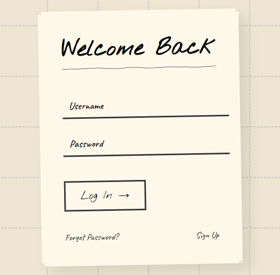
The HTML is simple and semantic. It includes a centered form inside a container with heading, input fields, a button, and links for password recovery and signup.
Open up your sketchy_login.html file and paste in the following HTML structure:
<!DOCTYPE html>
<html lang="en">
<head>
    <meta charset="UTF-8">
    <meta name="viewport" content="width=device-width, initial-scale=1.0">
    <title>Sketchy Login</title>
    <link href="https://fonts.googleapis.com/css2?family=Caveat:wght@500;700&family=Nothing+You+Could+Do&display=swap" rel="stylesheet">
    <style>
        /* Our CSS will go here */
    </style>
</head>
<body>
    <div class="sketch-container">
        <form class="login-form">
            <h1>Welcome Back</h1>

            <div class="input-group">
                <input type="text" placeholder=" " required>
                <label>Username</label>
            </div>

            <div class="input-group">
                <input type="password" placeholder=" " required>
                <label>Password</label>
            </div>

            <button type="submit" class="btn">Log In →</button>

            <div class="links">
                <a href="#">Forgot Password?</a>
                <a href="#">Sign Up</a>
            </div>
        </form>
    </div>
</body>
</html>
Here’s a quick summery of the key elements:
<div class="sketch-container">: This acts as the main wrapper for our login form, providing the “sketchbook” background and border.<form class="login-form">: This is the actual login form element.<div class="input-group">: These divs group each input field with its corresponding label, which we’ll style for a floating effect.<div class="links">: A container for the “Forgot Password?” and “Sign Up” links.
CSS Styling
Now for the magic! Paste the following CSS code within the <style> tags in your sketchy_login.html file:
body {
    background: #f0e6d3;
    min-height: 100vh;
    display: flex;
    align-items: center;
    justify-content: center;
    margin: 0;
    background-image: url('data:image/svg+xml,<svg width="100" height="100" viewBox="0 0 100 100" xmlns="http://www.w3.org/2000/svg"><rect x="0" y="0" width="100" height="100" fill="none" stroke="%23ccc" stroke-width="2" stroke-dasharray="5 2"/></svg>');
}

.sketch-container {
    background: #fff9ec;
    padding: 2.5rem;
    position: relative;
    transform: rotate(-1deg);
    box-shadow: 15px 15px 30px rgba(0,0,0,0.1);
    border: 6px solid transparent;
    border-image: url('data:image/svg+xml,<svg xmlns="http://www.w3.org/2000/svg" width="16" height="16" viewBox="0 0 24 24"><path fill="none" stroke="%23333" stroke-width="2" d="M2 2h20v20H2z" stroke-dasharray="4 4"/></svg>') 16 repeat;
}

.login-form {
    position: relative;
    max-width: 350px;
    font-family: 'Caveat', cursive;
}

h1 {
    font-family: 'Nothing You Could Do', cursive;
    font-size: 2.8rem;
    margin: 0 0 2rem;
    position: relative;
    display: inline-block;
}

h1:after {
    content: '';
    position: absolute;
    bottom: -10px;
    left: 0;
    right: 0;
    height: 4px;
    background: url('data:image/svg+xml,<svg xmlns="http://www.w3.org/2000/svg" viewBox="0 0 200 10"><path d="M0 5 Q 50 9 100 5 T 200 5" fill="none" stroke="%23333" stroke-width="2"/></svg>');
}

.input-group {
    margin: 1.5rem 0;
    position: relative;
}

.input-group input {
    width: 100%;
    padding: 12px;
    font-size: 1.2rem;
    background: none;
    border: 0;
    border-bottom: 3px solid #333;
    font-family: 'Caveat', cursive;
    outline: none;
    transition: all 0.3s;
}

.input-group input:focus {
    border-bottom-color: #ff6b6b;
}

.input-group label {
    position: absolute;
    left: 12px;
    top: 12px;
    font-size: 1.3rem;
    transition: all 0.3s;
    pointer-events: none;
}

.input-group input:focus + label,
.input-group input:not(:placeholder-shown) + label {
    top: -20px;
    left: 0;
    font-size: 1rem;
    color: #ff6b6b;
}

.btn {
    background: none;
    border: 3px solid #333;
    padding: 12px 30px;
    font-size: 1.4rem;
    margin: 1.5rem 0;
    cursor: pointer;
    font-family: 'Nothing You Could Do', cursive;
    position: relative;
    overflow: hidden;
    transition: all 0.3s;
}

.btn:hover {
    background: #ff6b6b;
    color: white;
    border-color: #ff6b6b;
}

.links {
    display: flex;
    justify-content: space-between;
    margin-top: 1rem;
}

.links a {
    color: #333;
    text-decoration: none;
    font-size: 1.1rem;
    position: relative;
}

.links a:after {
    content: '';
    position: absolute;
    bottom: -2px;
    left: 0;
    width: 0;
    height: 2px;
    background: #333;
    transition: width 0.3s;
}

.links a:hover:after {
    width: 100%;
}

@media (max-width: 480px) {
    .sketch-container {
        margin: 1rem;
        padding: 1.5rem;
    }
}
Let’s dissect the key CSS styles that contribute to the sketchy look:
body: Thebackground-imageproperty uses an inline SVG to create a subtle dashed grid pattern, mimicking lined paper. Thebackground-colorprovides a warm, off-white base..sketch-container: This div acts as our “sketchbook page.” It has a light yellow background (#fff9ec), padding, and a slight rotation (transform: rotate(-1deg)) to enhance the hand-drawn feel. Thebox-shadowadds a subtle lift, and theborder-imageproperty uses another inline SVG to create a dashed border around the container.h1: The heading uses the ‘Nothing You Could Do’ font for a playful, handwritten style. The:afterpseudo-element creates a wavy “underline” using an inline SVG path..input-group input: The input fields have a simple bottom border, giving them a minimalist yet slightly unfinished look. The ‘Caveat’ font reinforces the handwritten theme. The:focusstate changes the bottom border color for visual feedback..input-group label: The labels are positioned absolutely to create the “floating label” effect. They transition smoothly when the input field is focused or has content..btn: The button has a solid, slightly thick border and uses the ‘Nothing You Could Do’ font. The hover effect provides a simple color transition..links a: The links have a subtle underline animation on hover, adding a touch of interactivity without being overly polished.@media (max-width: 480px): This media query ensures that the layout adapts nicely to smaller screens, making the form responsive.
Customization Tips
Want to make your sketchy login form even cooler? Here are some fun and easy ways to customize it:
- Try Different Fonts
Explore other handwritten fonts from Google Fonts to give your form a new personality. Pick one that matches your style or mood. - Add More Sketchy Details
You can add fun doodles or hand-drawn shapes as background images—like a little pencil, paperclip, or even a coffee stain. These small touches can make your design more playful. - Change the Colors
Play with different background and text colors to match your brand or make it more unique. Soft pastels or bold contrasts—it’s up to you! - Use Smooth Animations
Add simple hover or focus animations to make buttons and inputs feel more alive. A slight bounce or fade-in can go a long way. - Use a Paper-Like Background
Give the form a real paper feel by using a light paper texture in the background. You can use a faded image or an SVG pattern with low opacity. - Try Hand-Drawn Icons
Instead of regular text links, you can use hand-drawn icons for things like “Forgot Password?” or “Sign Up.” You can draw them yourself or find free ones online.
Conclusion
This sketch-style login form is a creative and fun way to make your site feel personal and hand-crafted. With just HTML and CSS, you can build a visually engaging UI that stands out—and it’s responsive, accessible, and ready to be extended.
Whether you’re creating a portfolio, a landing page, or an experimental UI, give this design a try!