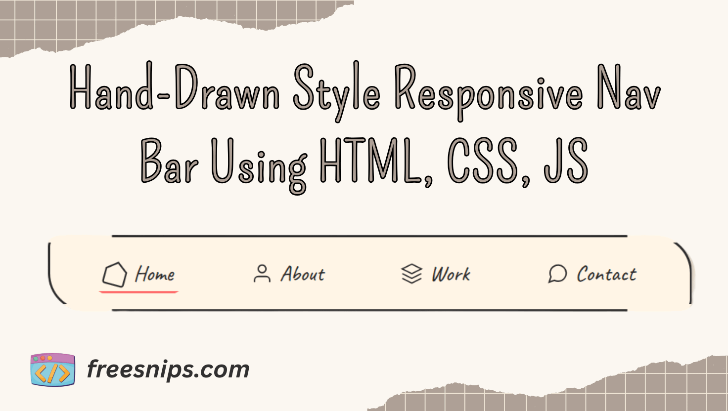
How to Build a Hand-Drawn Style Responsive Nav Bar Using HTML, CSS, JS
Want to add a playful, hand-drawn feel to your site’s navigation? In this guide, you’ll learn how to build a “sketchy” navigation bar using just HTML, CSS, and JavaScript. We’ll cover each step from markup to interactivity, so even beginners can follow along and end up with a fun, responsive menu that looks like it was drawn by hand.
Introduction
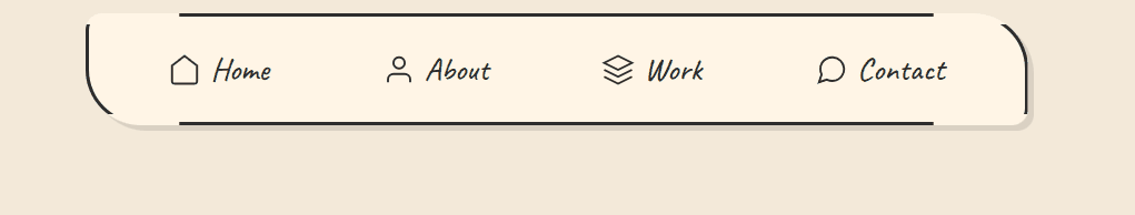
In a world of sleek, minimalist designs, sometimes it’s fun to stand out with a bit of hand-crafted charm. This navigation design uses CSS to mimic the look of ink on paper, with a slightly irregular border and a playful underline animation on hover. It also includes a smooth, circular reveal for the mobile menu, making it engaging for users on all devices. This approach can inject warmth and a personal touch into your website’s user experience.
Setup Your Project Files
HTML file (e.g. index.html):
- Paste the desktop
<nav>markup into<body>. - Immediately below it, paste the mobile
<nav>+ hamburger markup. - Link your CSS in
<head>:<link rel="stylesheet" href="style.css"> - Include your JS just before
</body>:<script src="script.js"></script>
2. CSS file:
- Create
style.cssand paste in all the CSS rules.
3. JS file:
- Create
script.jsand paste in the JavaScript code.
HTML Structure
Our markup is straightforward: two <nav> elements—one for desktop and one for mobile—each with a list of links. Icons are embedded as inline SVGs for crisp, scalable graphics. We also include a hamburger button to toggle the mobile menu.
Desktop Navigation
Lets, create the html file with any name you want. Copy and Paste the below code inside <body> tag.
  <!-- Desktop Navigation -->
    <nav class="sketch-nav">
        <ul class="nav-list">
            <li class="nav-item">
                <a href="#home" class="nav-link">
                    <svg class="nav-icon" viewBox="0 0 24 24" fill="none" stroke="currentColor">
                        <path d="M3 9l9-7 9 7v11a2 2 0 0 1-2 2H5a2 2 0 0 1-2-2z" stroke-width="1.5"/>
                    </svg>
                    Home
                </a>
            </li>
            <li class="nav-item">
                <a href="#about" class="nav-link">
                    <svg class="nav-icon" viewBox="0 0 24 24" fill="none" stroke="currentColor">
                        <path d="M20 21v-2a4 4 0 0 0-4-4H8a4 4 0 0 0-4 4v2" stroke-width="1.5"/>
                        <circle cx="12" cy="7" r="4" stroke-width="1.5"/>
                    </svg>
                    About
                </a>
            </li>
            <li class="nav-item">
                <a href="#work" class="nav-link">
                    <svg class="nav-icon" viewBox="0 0 24 24" fill="none" stroke="currentColor">
                        <path d="M12 2L2 7l10 5 10-5-10-5zM2 17l10 5 10-5M2 12l10 5 10-5" stroke-width="1.5"/>
                    </svg>
                    Work
                </a>
            </li>
            <li class="nav-item">
                <a href="#contact" class="nav-link">
                    <svg class="nav-icon" viewBox="0 0 24 24" fill="none" stroke="currentColor">
                        <path d="M21 11.5a8.38 8.38 0 0 1-.9 3.8 8.5 8.5 0 0 1-7.6 4.7 8.38 8.38 0 0 1-3.8-.9L3 21l1.9-5.7a8.38 8.38 0 0 1-.9-3.8 8.5 8.5 0 0 1 4.7-7.6 8.38 8.38 0 0 1 3.8-.9h.5a8.48 8.48 0 0 1 8 8v.5z" stroke-width="1.5"/>
                    </svg>
                    Contact
                </a>
            </li>
        </ul>
</nav>- A
<nav>element with the classsketch-navwraps the entire desktop menu. - Inside, an unordered list (
<ul class="nav-list">) holds all navigation items. - Each navigation item is an
<li class="nav-item">. - Within each
<li>, there’s an anchor tag (<a class="nav-link">) pointing to a page section. - Inline SVG icons are included inside each
<a>to provide visual cues alongside link text.
Mobile Navigation
Copy and Paste the below code inside <body> tag after desktop navigation markup.
<!-- Mobile Navigation -->
    <button class="mobile-menu-btn" id="menuBtn">
        <div class="hamburger">
            <span class="hamburger-line"></span>
            <span class="hamburger-line"></span>
            <span class="hamburger-line"></span>
        </div>
    </button>

    <nav class="mobile-nav" id="mobileNav">
        <ul class="mobile-nav-list">
            <li class="mobile-nav-item" style="--i: 1">
                <a href="#home" class="nav-link">
                    <svg class="nav-icon" viewBox="0 0 24 24" fill="none" stroke="currentColor">
                        <path d="M3 9l9-7 9 7v11a2 2 0 0 1-2 2H5a2 2 0 0 1-2-2z" stroke-width="1.5"/>
                    </svg>
                    Home
                </a>
            </li>
            <li class="mobile-nav-item" style="--i: 2">
                <a href="#about" class="nav-link">
                    <svg class="nav-icon" viewBox="0 0 24 24" fill="none" stroke="currentColor">
                        <path d="M20 21v-2a4 4 0 0 0-4-4H8a4 4 0 0 0-4 4v2" stroke-width="1.5"/>
                        <circle cx="12" cy="7" r="4" stroke-width="1.5"/>
                    </svg>
                    About
                </a>
            </li>
            <li class="mobile-nav-item" style="--i: 3">
                <a href="#work" class="nav-link">
                    <svg class="nav-icon" viewBox="0 0 24 24" fill="none" stroke="currentColor">
                        <path d="M12 2L2 7l10 5 10-5-10-5zM2 17l10 5 10-5M2 12l10 5 10-5" stroke-width="1.5"/>
                    </svg>
                    Work
                </a>
            </li>
            <li class="mobile-nav-item" style="--i: 4">
                <a href="#contact" class="nav-link">
                    <svg class="nav-icon" viewBox="0 0 24 24" fill="none" stroke="currentColor">
                        <path d="M21 11.5a8.38 8.38 0 0 1-.9 3.8 8.5 8.5 0 0 1-7.6 4.7 8.38 8.38 0 0 1-3.8-.9L3 21l1.9-5.7a8.38 8.38 0 0 1-.9-3.8 8.5 8.5 0 0 1 4.7-7.6 8.38 8.38 0 0 1 3.8-.9h.5a8.48 8.48 0 0 1 8 8v.5z" stroke-width="1.5"/>
                    </svg>
                    Contact
                </a>
            </li>
        </ul>
</nav>- A
<button>withclass="mobile-menu-btn"andid="menuBtn"serves as the hamburger menu trigger. - Inside the button, a
<div class="hamburger">contains three<span class="hamburger-line">elements to render the hamburger icon. - The mobile menu itself is a
<nav class="mobile-nav" id="mobileNav">. - It contains a
<ul class="mobile-nav-list">mirroring the desktop links. - Each
<li class="mobile-nav-item">has an inline style--i: n(where n is a number) to enable staggered animation delays.
CSS Styling: The “Sketchy” Magic
Create css file style.css. Copy and paste below css style into style.css file.
:root {
            --ink-color: #2d2d2d;
            --paper: #fff5e6;
            --highlight: #ff6b6b;
        }

        body {
            margin: 0;
            min-height: 100vh;
            background: #f3e9d9;
            font-family: 'Caveat', cursive;
        }

        /* Desktop Navigation */
        .sketch-nav {
            max-width: 800px;
            margin: 2rem auto;
            padding: 1.5rem;
            background: var(--paper);
            border-radius: 15px 50px;
            position: relative;
            box-shadow: 5px 5px 0 rgba(0,0,0,0.1);
        }

        .nav-list {
            list-style: none;
            padding: 0;
            margin: 0;
            display: flex;
            justify-content: space-around;
        }

        .nav-item {
            position: relative;
        }

        .nav-link {
            text-decoration: none;
            color: var(--ink-color);
            font-size: 1.8rem;
            display: flex;
            align-items: center;
            padding: 0.5rem;
            transition: all 0.3s;
        }

        /* Hand-drawn underline effect */
        .nav-link::after {
            content: '';
            position: absolute;
            bottom: 0;
            left: 0;
            width: 0;
            height: 3px;
            background: var(--highlight);
            clip-path: polygon(0 0, 100% 0, 95% 100%, 5% 100%);
            transition: all 0.4s ease-out;
        }

        .nav-link:hover::after {
            width: 100%;
            animation: sketchLine 0.8s linear forwards;
        }

        /* Sketchy border animation */
        .sketch-nav::before {
            content: '';
            position: absolute;
            inset: 0;
            border: 3px solid var(--ink-color);
            border-radius: inherit;
            clip-path: polygon(
                0% 10%, 10% 10%, 10% 0%,
                90% 0%, 90% 10%, 100% 10%,
                100% 90%, 90% 90%, 90% 100%,
                10% 100%, 10% 90%, 0% 90%
            );
        }

        /* Icons */
        .nav-icon {
            width: 30px;
            height: 30px;
            margin-right: 0.5rem;
            transition: transform 0.3s;
        }

        .nav-link:hover .nav-icon {
            transform: rotate(15deg) scale(1.2);
        }

        /* Mobile Hamburger Icon */
        .mobile-menu-btn {
            display: none;
            position: fixed;
            top: 20px;
            right: 20px;
            z-index: 1000;
            background: var(--paper);
            border: 3px solid var(--ink-color);
            border-radius: 50%;
            width: 60px;
            height: 60px;
            cursor: pointer;
            box-shadow: 3px 3px 0 rgba(0,0,0,0.1);
        }

        .hamburger {
            position: absolute;
            top: 50%;
            left: 25%;
            transform: translate(-50%, -50%);
            width: 30px;
            height: 24px;
        }

        .hamburger-line {
            position: absolute;
            width: 100%;
            height: 3px;
            background: var(--ink-color);
            transition: all 0.3s ease;
            transform-origin: center;
        }

        .hamburger-line:nth-child(1) { top: 25%; }
        .hamburger-line:nth-child(2) { top: 50%; }
        .hamburger-line:nth-child(3) { top: 75%; }

        /* Mobile Menu */
        .mobile-nav {
            display: none;
            position: fixed;
            top: 0;
            left: 0;
            width: 100%;
            height: 100%;
            background: var(--paper);
            z-index: 999;
            clip-path: circle(0 at 90% 5%);
            transition: clip-path 0.8s cubic-bezier(0.645, 0.045, 0.355, 1);
        }

        .mobile-nav-list {
            list-style: none;
            padding: 80px 20px 20px;
            margin: 0;
            display: flex;
            flex-direction: column;
            align-items: center;
        }

        .mobile-nav-item {
            margin: 15px 0;
            opacity: 0;
            transform: translateY(20px);
            transition: all 0.4s ease;
        }

        /* Active States */
        .menu-open .mobile-nav {
            clip-path: circle(150% at 90% 5%);
        }

        .menu-open .hamburger-line:nth-child(1) {
            transform: translateY(8px) rotate(45deg);
        }

        .menu-open .hamburger-line:nth-child(2) {
            opacity: 0;
        }

        .menu-open .hamburger-line:nth-child(3) {
            transform: translateY(-5px) rotate(-45deg);
        }

        .menu-open .mobile-nav-item {
            opacity: 1;
            transform: translateY(0);
            transition-delay: calc(0.1s * var(--i));
        }

        @keyframes sketchLine {
            0% { clip-path: polygon(0 0, 0 0, 0 100%, 0 100%); }
            50% { clip-path: polygon(0 0, 80% 0, 70% 100%, 0 100%); }
            100% { clip-path: polygon(0 0, 100% 0, 95% 100%, 5% 100%); }
        }

        /* Responsive Design */
        @media (max-width: 768px) {
            .sketch-nav {
                display: none;
            }

            .mobile-menu-btn {
                display: block;
            }

            .mobile-nav {
                display: block;
            }
}:root– Defines custom CSS properties (colors) for easy theming across the stylesheet.body– Resets margins, ensures the page fills the viewport height, sets the background color, and applies the hand-written font..sketch-nav– Styles the desktop navigation container with padding, a paper-like background, rounded corners, and a subtle drop shadow..nav-list– Removes default list styling and lays out navigation items evenly in a horizontal row..nav-item– Positions each navigation item relative to allow for absolute positioning of child elements..nav-link– Styles each link with no underline, the ink color, larger hand-drawn font size, and smooth hover transitions..nav-link::after– Creates an invisible, hand-drawn-style underline that will animate on hover..nav-link:hover::after– Expands and animates the underline to full width when the link is hovered..sketch-nav::before– Draws a sketch-style border around the navigation using an irregular clip-path..nav-icon– Sets the size and margin for the SVG icons and enables smooth transform animations..nav-link:hover .nav-icon– Rotates and scales the icon slightly when its parent link is hovered..mobile-menu-btn– Defines a hidden-by-default circular button for mobile that appears at the top-right as the hamburger trigger..hamburger– Centers and sizes the three-line hamburger icon inside its button..hamburger-line– Styles each line of the hamburger with the ink color and sets up smooth transforms..hamburger-line:nth-child(1)– Positions the top line of the hamburger icon..hamburger-line:nth-child(2)– Positions the middle line of the hamburger icon..hamburger-line:nth-child(3)– Positions the bottom line of the hamburger icon..mobile-nav– Defines the full-screen mobile menu, initially clipped to a small circle and hidden behind the page..mobile-nav-list– Removes list styling and centers mobile nav items vertically with padding at the top..mobile-nav-item– Starts each mobile item off invisible and slightly shifted down for later animation..menu-open .mobile-nav– Expands the mobile menu’s circular clip-path to reveal the menu when active..menu-open .hamburger-line:nth-child(1)– Transforms the top hamburger line into part of an “X” when the menu is open..menu-open .hamburger-line:nth-child(2)– Fades out the middle hamburger line when the menu is open..menu-open .hamburger-line:nth-child(3)– Transforms the bottom hamburger line into the other part of an “X” when the menu is open..menu-open .mobile-nav-item– Fades in and slides up each mobile nav item with a staggered delay when the menu is open.@keyframes sketchLine– Defines the drawing animation for the hand-drawn underline effect.@media (max-width: 768px)– Switches to mobile view by hiding the desktop nav, showing the hamburger button, and enabling the mobile menu.
JavaScript Functionality
A small script toggles the .menu-open class on the <body> when the hamburger is clicked—triggering our CSS transitions:
Create script.js file. Copy and paste below js code into script.js file.
const menuBtn = document.getElementById('menuBtn');
        const mobileNav = document.getElementById('mobileNav');

        // Toggle mobile menu
        menuBtn.addEventListener('click', () => {
            document.body.classList.toggle('menu-open');
        });

        // Close menu when clicking outside
        document.addEventListener('click', (e) => {
            if (!menuBtn.contains(e.target) && !mobileNav.contains(e.target)) {
                document.body.classList.remove('menu-open');
            }
        });

        // Close menu with Escape key
        document.addEventListener('keydown', (e) => {
            if (e.key === 'Escape') {
                document.body.classList.remove('menu-open');
            }
        });
Customization Tips
- Change the Sketch Style: Tweak the
clip-pathcoordinates to get thicker or more jagged “ink” effects. - Swap Icons: Replace the inline SVGs with your own icons (just keep the
.nav-iconsizing). - Adjust Timing: Speed up or slow down hover animations by modifying
transition-durationandanimationtiming. - Theme Colors: Override
--ink-color,--paper, or--highlightto match your brand palette.
Conclusion
This tutorial provides a fun and engaging way to style your website’s navigation with a hand-drawn aesthetic. By understanding the HTML structure, CSS styling techniques (including pseudo-elements, clip-path, and animations), and basic JavaScript for mobile interactivity, you can implement and customize this unique navigation to add a personal touch to your web projects. Experiment with the customization tips to truly make it your own!